Chapter 8 Using figures to understand and present data
Visualising data in the form of figures is the most essential element of all data analysis. Figures are used throughout the workflow of an analysis. We could break the process down into three main stages, although the bounudaries betweeen each are not hard and fast.
The first figures in any anañysis are usually exploratory in nature. These sort of figures will not make their way into the final write up of the analysis. However they are essential for making sense of the data. It is very difficult to understand data simply as a set of numbers. It is much easier to understand data when the numbers are turned into some sort of visual representation. Although you should keep a copy of these figures and make some notes on them they are only really for your own reference.
The second class of figures are important when choosing how to apply statistics to the data. These figures are diagnostic in nature. They allow the analyst to evaluate whether the assumptions of the model (or test) are met. Some of these figures should be included in appendices and supplementary materials as they can be used to justify the choice of statistics. Some may be used in a publication if it is essential to show how the analytical method was chosen.
The final class of figures are those that will always make it into the main body of the final report. The important elements to think about when designing and selecting figures for the results section are clarity and relevance. The figures need to clearly display relevant elements of the data that help the reader to draw conclusions. The complexity of the conclusions depend on the nature of the study. Inferential statistics are not always possible nor necessary in order to tell the story that is contained in the data. Often the simplest figures prove to be the most effective.
Libraries used
library(tidyverse)
library(aqm)
library(sf)
library(mgcv)
library(plotly)
8.1 Quick exploratory plots
Base graphics in R produce quick, simple figures that can useful in the intial stages of analysis.
For example, if we have a variable called height in a data frame called d then just typing hist(d$height) in a code chunk or the console produces a quick histogram. Simple boxplots and scatter plots are just as easy.
data(arne_2019)
hist(pine_hts$HeCM)
boxplot(pine_hts$HeCM)
plot(pine_hts$DiMM,pine_hts$HeCM)
If one of the variables is categorical then a call to a base plot adjusts to form a boxplot rather than a sctterplot
pine_hts$Site<-as.factor(pine_hts$Site)
plot(pine_hts$Site, pine_hts$Age)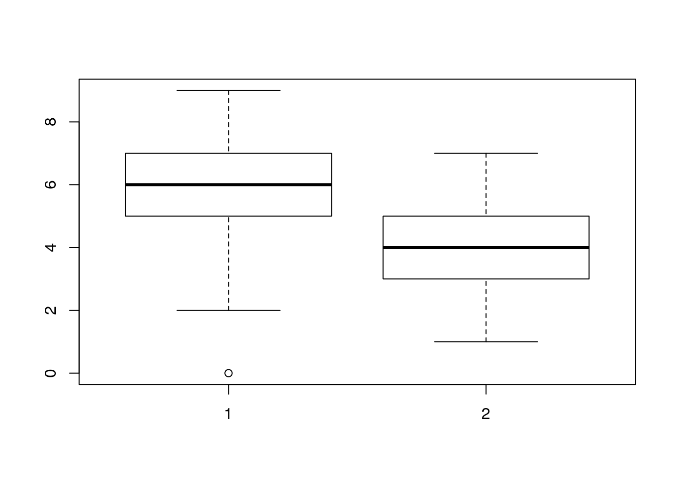
Base graphics are really quick to use and they don’t involve typing long pieces of code. Although they can be customised to produce really neat figures, they tend to have a rather “retro” look and feel. So it is worth learning how to make modern looking graphics.
8.2 Introduction to grammar of graphics plots
In order to produce figures that can be really honed up to publication quality we will use the package ggplots2.
Grammar of Graphics plots (ggplots) were designed by Hadley Wickam, who also programmed dplyr. This is “tidy” approach to programming that is more powerful than base R. The syntax differs from base R syntax in various ways. It can take some time to get used to. However ggplots provides an extremely elegant framework for building really nice looking figures with comparatively few lines of code.
8.3 Simple bar charts
The simplest figures of all are probably barcharts.
Barcharts are used when the data consist of counts or percentage. Sometimes barcharts have been used to show means. These sort of barcharts with confidence intervals are inferential and are also known as “dynamite charts”. Although they are still used in some publications dynamite plots are best avoided. We will retun to this issue, but you may want to have a quick look at http://emdbolker.wikidot.com/blog:dynamite
Genuine barcharts are non inferential. In other words no statistical tests are associated with them directly. They are simply used to display information.
Let’s look at the simplest case possible where barcharts may be used. At the end of Spetember 2019 a group of Bournemouth University students monitored the traffic on the roads around the campus. They provided data on the counts of different types of vehicles passing each hour. Here is their data as they summarised it.
data(butraffic)
dt(butraffic)
These very simple data have no replication at all. Therefore there is no possibility of conducting any form of inferential statistical analysis. Sometimes a Chi Squared goodness of fit test can be used to test whether there is a significant difference between counts in each group, but this would clearly not be appropriate in this case as the differences are very apparent. However we can show the results to the reader more clearly through a figure than a table.
To form a standard barchart in gglots we first need to decide how the data will be mapped onto the elements that make up the plot. The term for this in ggplot speak is “aesthetics”- Personally I find the term aestehetics to represent mapping a bit misleading. I would instinctively assume that aesthetics refers to the colour scheme or other visual aspect of the final plot. In fact the aesthetics are the first thing to decide on, rather than the last.
The way to build a ggplot is by first forming an invisible object which represents the mapping of data onto the page. The way these data are presented can then be changed through adding differnt geometries. The only aesthetics (mappings) that you need to know about for basic usage are x,y, colour, fill, group and label. The x and y mappings coincide with axes, so are simple enough. Remember that a histogram maps onto the x axis. The y axis shows either frequency or density so is not mapped directly as a variable in the data.
The variable on the x axis in this case would be the Vehicle type. The count of the number of vehicles would be placed on the y axis. If we want to label the figure with the actual number counted (which is good practice for barcharts if feasible) we could add a label aesthetic as well.
g0<-ggplot(butraffic,aes(x=Vehicle,y=Count, label=Count)) Now let’s plot out the barplot. We do that by adding a geometry. There are two geometries that could be used heere. The simplest in this case is to use geom_col and add the label. We’ll assign the result to g1, then type the name g1 to plot it. That way if we want to continue modifying our plot we just add to g1.
g1<- g0 + geom_col() + geom_label()
# An alternative which does the same thing is geom_bar with identity stat.
# g1<- g0 + geom_bar(stat="identity") + geom_label()
g1
Note that if geom_bar is used then you need to tell R to use the “identity” stat if a table of counts is used. The default stat in this case is count, i.e. geom_bar itself will form a count table from raw data.
This figure looks OK, but it would be much clearer to have the bars in a ranked order.
To do this in R we use the follwing code. First tell R to arrange the data frame according to Count. To place in ascending order use -Count. Then a little trick is used to relevel the Vehicle factor levels to match the arrangement.
butraffic %>% arrange(-Count) %>%
  mutate(Vehicle = factor(Vehicle, Vehicle)) -> butraffic
We are going to have to set up the aesthetics again to use this, as the data have changed.
By default the background used for the first figure was grey. We can also change the look and feel of subsequent plots by setting the theme. A black and white theme might be better for printing.
theme_set(theme_bw())g0<-ggplot(butraffic,aes(x=Vehicle,y=Count, label=Count))
g1<- g0 + geom_col() + geom_label()
g1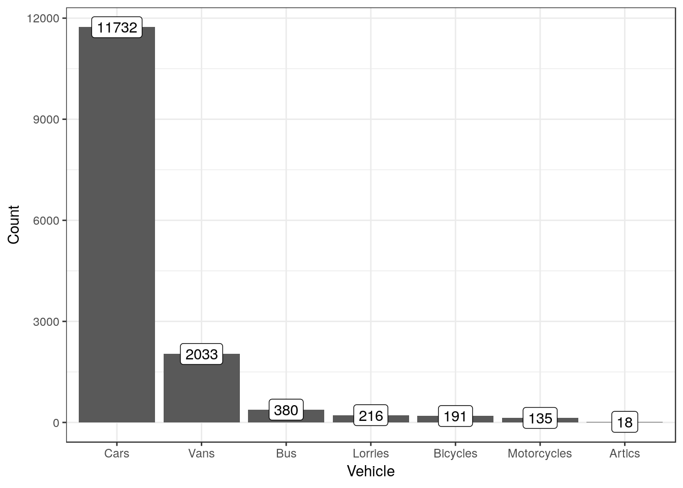
To show the results as percentages we can calculate them using another line of dplyr code.
butraffic %>% mutate(Percent=round(100*Count/sum(Count),1)) ->butraffic

g0<-ggplot(butraffic,aes(x=Vehicle,y=Percent, label=paste(Percent, "%", sep="")))
g2<-g0 + geom_col() + geom_label()
g2
8.3.1 Exercise
- The following code chunk produces the number of votes cast for each party in Bournemouth west.
data(ge2017)
ge2017 %>% filter(constituency=="Bournemouth West") %>% select(c("party","votes")) ->bw
## Adding missing grouping variables: `constituency`dt(bw)Form barcharts using both counts and percentages.
- The following code simulates responses to a question on the Likert scale
d<-data.frame(table(rand_likert()))
names(d)<-c("Resonse", "Count")
Form a barchart using these data.
Note that analysing a full questionaire would involve looking at the responses to many questions simultaneously.R has some additional graphical tools for this
8.4 Simple Line charts
Do not confuse genuine line charts with scatterplots with a fitted line. Line charts are usually non inferential figures (i.e. they do not show confidence intervals). A common use for a line chart is to show a time series.
We’ll extract a portion of data on rainfall from a larger data set. The code below produces a small data frame of annual rainfall measured at the Hurn meteorological station.
data("met_office")
met_office %>% filter(station=="hurn" & Year < 2018 & Year > 1999) %>% group_by(Year) %>% summarise(rain=sum(rain))-> rain

dt(rain)
We’ll set up the aesthetics. The x axis is the year, the rainfall goes on the y axis. We might want to use the number as a label.
g0<-ggplot(rain, aes(x=Year,y=rain,label=rain))Now, adding geom_line produces a basic line chart.
g1 <- g0 + geom_line()
g1
This might look better if the actual numbers are shown. This only works for short time series with few values. If there are more values the plot would look too cluttered.
g1 <- g1 + geom_label()
g1
Now we might want to add a title and some text for the x and y axes.
g1<- g1 + labs(title = "Annual precipitation recorded at Hurn meterological station, Dorset", x="Year", y="Total annual precipitation in mm")
g1
This looks better, but its a bit difficult to see which year the number applies to. We can set the breaks on the continyuos x axis with scale_x_continuous(breaks = )
g1 <-g1 + scale_x_continuous(breaks=1999:2018)
g1
A final touch might be to rotate the text on xaxis.
g1 <- g1 + theme(axis.text.x=element_text(angle=45, hjust=1))
g1
8.4.1 Exercise
These lines of code produce a data frame with the mean annual temperature.
met_office %>% filter(station=="hurn" & Year < 2018 & Year > 1999) %>% group_by(Year) %>% summarise(tmean=round(mean((tmax+tmin)/2),1))-> tmeanForm a line chart of the mean annual temperatures at Hurn.
8.5 Histograms
Typical histograms use only one variable at a time, although they may be “conditioned” by some grouping variable. The aim of a histogram is to show the distribution of the variable clearly. Let’s try ggplot histograms in ggplot2 using some simple data on mussel shell length at six sites.
data(mussels)
d<-mussels
To produce a simple histogram we only need to provide ggplot2 with the name of the variable we are going to use as the x aesthetic.
g0 <- ggplot(data=d,aes(x=Lshell))8.5.1 Default histogram
The default geom for the histogram is very simple. The goemetry is associated with statistical function that forms a histogram by counting the number of observation falling into the bins.
g0 + geom_histogram()## `stat_bin()` using `bins = 30`. Pick better value with `binwidth`.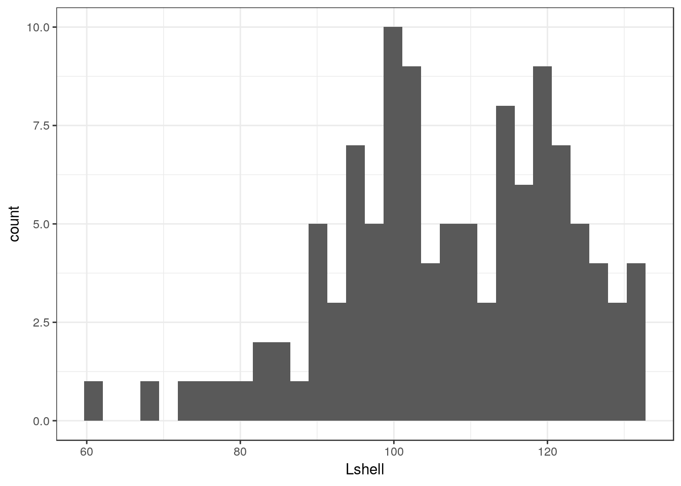
There are several things to notice here. One is that the default histogram looks rather like some of the figures in Excel. For some purposes this can be useful. However you may prefer to change this. This is easy to change. You are also warned that the default binwidth may not be ideal.
My own default settings for a histogram would therefore look more like this.
g1<-g0 +geom_histogram(fill="grey",colour="black",binwidth=10) + theme_bw()
g1
This should be self explanatory. The colour refers to the lines. It is usually a good idea to set the binwidth manually. You can choose the binwidth through trying a range before decising on which looks the best for your readers. Notice that I have assigned the results to an object called g1. We can then work with this to produce conditional histograms.
8.5.2 Facet wrapping
Conditioning the data on one grouping variable is very simple using a facet_wrap. Facets are the term used in ggplots for the panels in a lattice plot. There are two facet functions. Facet_wrap simply wraps a one dimensional set of panels into what should be a convenient number of columns and rows. You can set the number of columns and rows if the results are not as you want.
g_sites<-g1+facet_wrap(~Site)
g_sites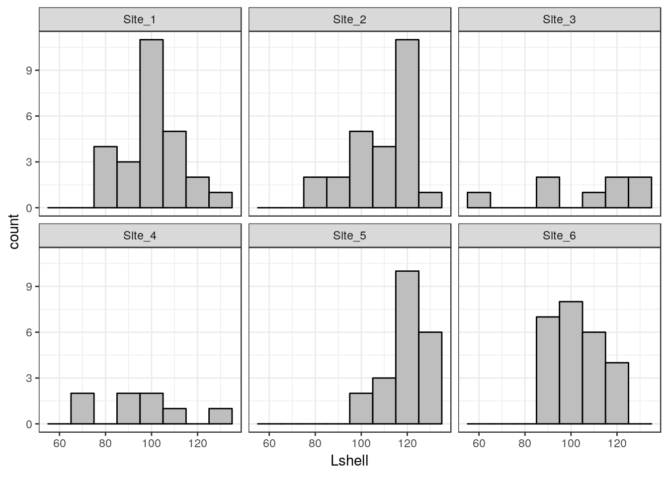
8.6 Boxplots
A grouped boxplot uses the grouping variable on the x axis. So we need to change the aesthetic mapping to reflect this.
data("mussels")
d<-mussels

g0 <- ggplot(d,aes(x=Site,y=Lshell))
g_box<-g0 + geom_boxplot(fill="grey",colour="black")+theme_bw()
g_box
8.7 Confidence interval plots
One important rule that you should try to follow when presenting data and carrying out any statistical test is to show confidence intervals for key parameters. Remember that boxplots show the actual data. Parameters extracted from the data are means when the data are grouped by a factor. When two or more numerical variables are combined the parameters refer to the statistical model, as in the case of regression.
Grammar of graphics provides a convenient way of adding statistical summaries to the figures. We can show the position of the mean mussel shell length for each site simply by asking to plot the mean for each y like this.
data("mussels")
d<-mussels
g0 <- ggplot(d,aes(x=Site,y=Lshell))
g_mean<-g0+stat_summary(fun.y=base::mean,geom="point")
g_mean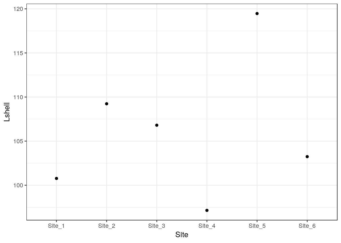
This is not very useful. However you can add confidence intervals themselves by a call to a stat_summary. The syntax is slightly involved.
g_mean+stat_summary(fun.data=mean_cl_normal,geom="errorbar")
To save some typing I’ve added a ci function to the aqm package that will add both these geometries to a graphic in one call.
g1<-aqm::ci(g0)
g1
If you want more robust confidence intervals with no assumption of normality of the residulas then you can use bootstrapping. In this case the result should be just about identical, as the errors are approximately normally distributed.
g_mean+stat_summary(fun.data=mean_cl_boot,geom="errorbar")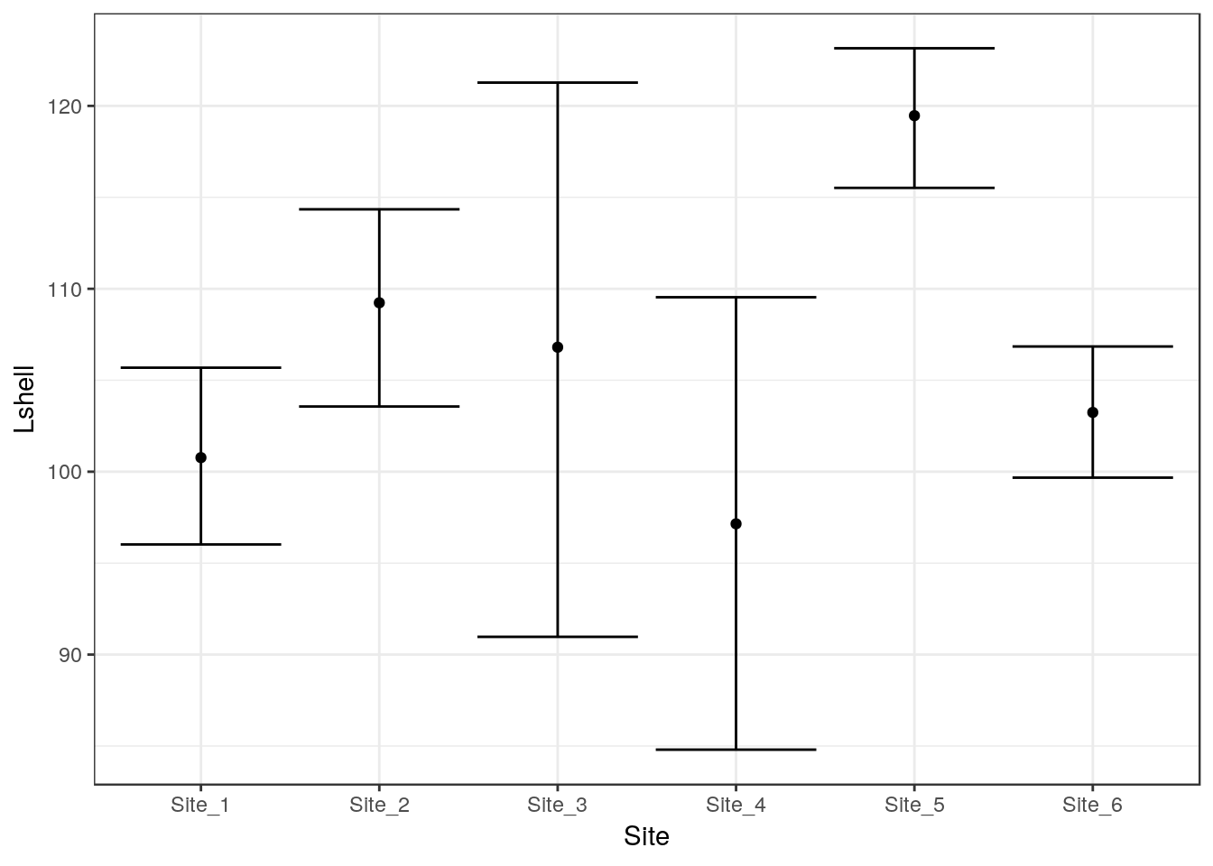
8.7.1 Dynamite plots (Don’t use!)
The traditional “dynamite” plots with a confidence interval over a bar can be formed in the same way.
g0 <- ggplot(d,aes(x=Site,y=Lshell))
g_mean<-g0+stat_summary(fun.y=base::mean,geom="bar")
g_mean+stat_summary(fun.data=mean_cl_normal,geom="errorbar")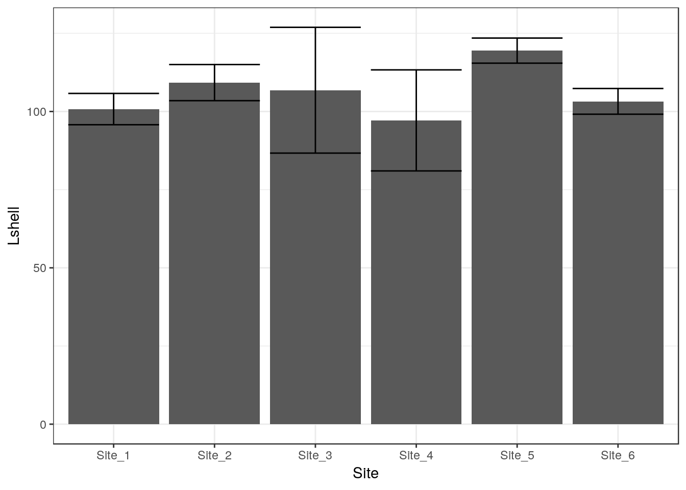
Most statisticians prefer that the means are shown as points rather than bars. You may want to look at the discussion on this provided by Ben Bolker.
8.7.2 Inference on medians
One way to infer differences between medians is to plot boxplots with notches.
g0 <- ggplot(d,aes(x=Site,y=Lshell))
g_box<-g0 + geom_boxplot(fill="grey",colour="black", notch=TRUE)+theme_bw()
g_box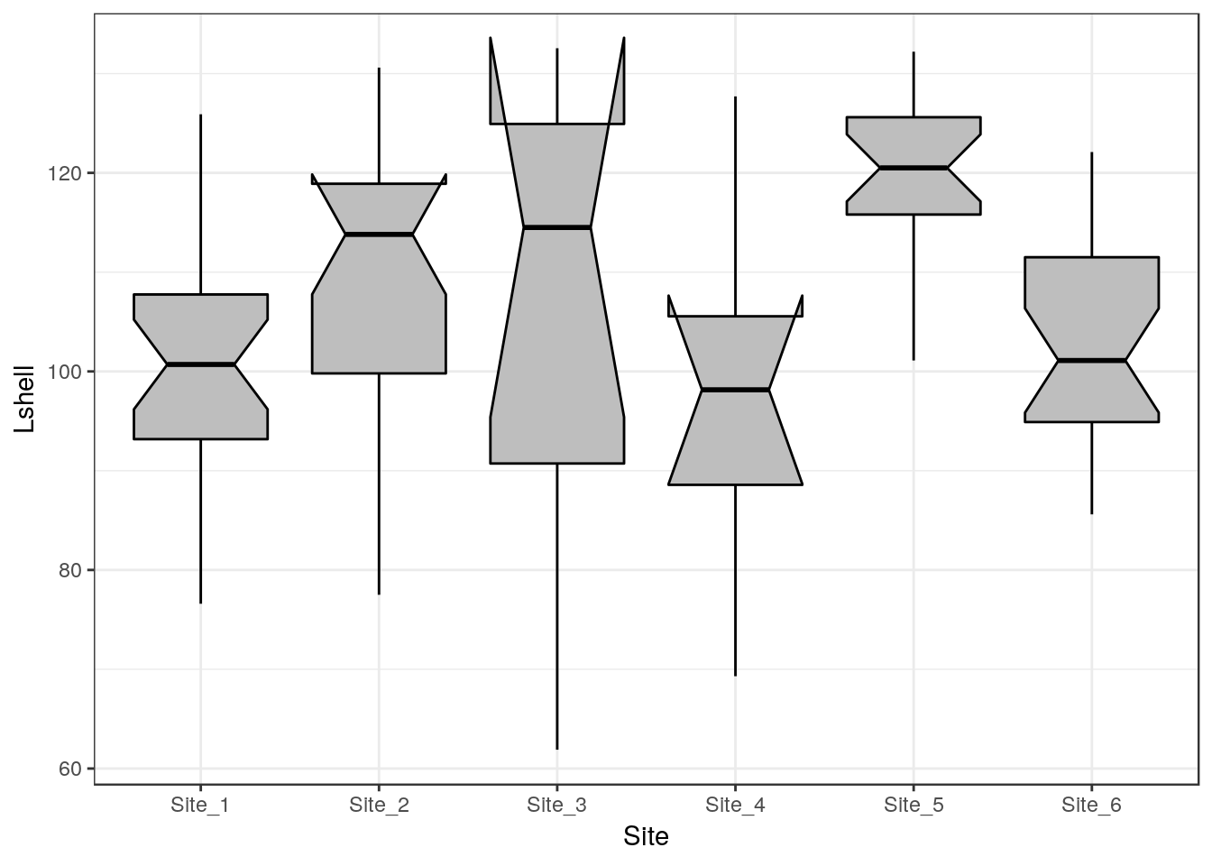
The notch forms a confidence interval around the median. This is based on the median \(\frac {\pm 1.57 IQR} {\sqrt(n)}\). According to Graphical Methods for Data Analysis (Chambers, 1983) although not a formal test the, if two boxes’ notches do not overlap there is ‘strong evidence’ (95% confidence) thet their medians differ.
A more precise appraoch is to use bootstrapping to calculate confidence intervals.
# Function included in aqm package

# median_cl_boot <- function(x, conf = 0.95) {
#   lconf <- (1 - conf)/2
#   uconf <- 1 - lconf
#   require(boot)
#   bmedian <- function(x, ind) median(x[ind])
#   bt <- boot(x, bmedian, 1000)
#   bb <- boot.ci(bt, type = "perc")
#   data.frame(y = median(x), ymin = quantile(bt$t, lconf), ymax = quantile(bt$t,
#                                                                           uconf))
# }
This has been added to the aqm package. So using this function the medians and confidence intervals can be plotted. This is a valid apprach even for skewed data.
g0+ stat_summary(fun.data = aqm::median_cl_boot, geom = "errorbar") + stat_summary(fun.y = median, geom = "point")
You can now draw inference on the differences in the usual way.
8.8 Scatterplots
Scatterplots can be built up in a similar manner. We first need to define the aesthetics. In this case there are clearly a and y coordinates that need to be mapped to the names of the variables.
g0 <- ggplot(d,aes(x=Lshell,y=BTVolume))

g0+geom_point()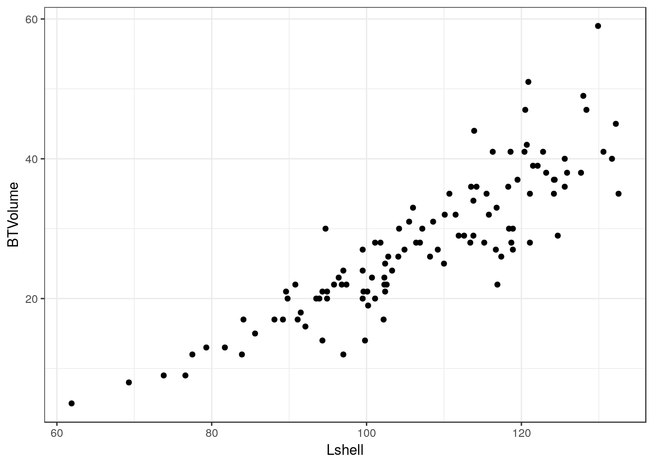
8.8.1 Adding a regression line
It is very easy to add a regression line with confidence intervals to the plot.
g0+geom_point()+geom_smooth(method = "lm", se = TRUE)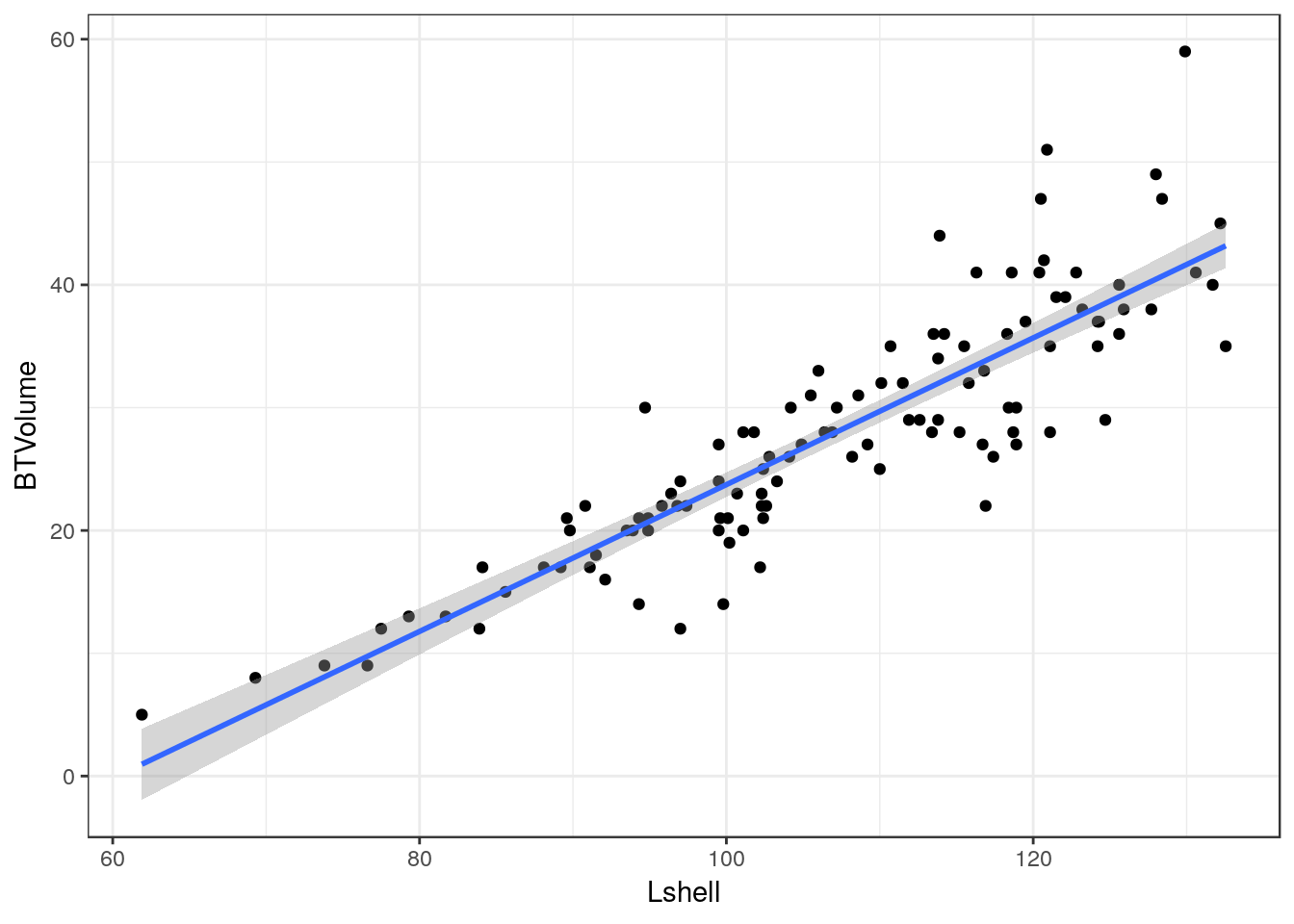
Although the syntax reads “se=TRUE” this refers to 95% confidence intervals.
8.8.2 Grouping and conditioning
There are various ways of plotting regressions for each site. We could define a colour aesthetic that will automatically group the data and then plot all the lines as one figure.
g0 <- ggplot(d,aes(x=Lshell,y=BTVolume,colour=Site))
g1<-g0+geom_point()+geom_smooth(method = "lm", se = TRUE)
g2<-g1+geom_point(aes(col=factor(Site)))
g2
This can be split into panels using facet wrapping.
g2+facet_wrap(~Site)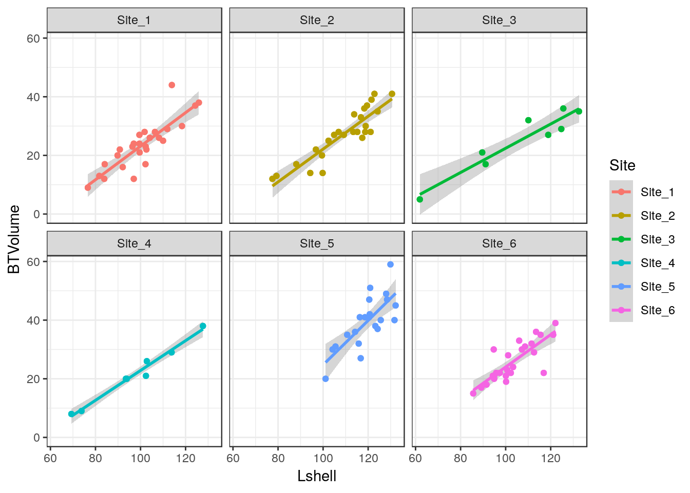
8.8.3 Curvilinear relationships
Many models involving two variables can be visualised using ggplot.
d<-read.csv(system.file("extdata", "marineinverts.csv", package = "aqm"))
str(d)
## 'data.frame': 45 obs. of 4 variables:
## $ richness: int 0 2 8 13 17 10 10 9 19 8 ...
## $ grain : num 450 370 192 194 197 ...
## $ height : num 2.255 0.865 1.19 -1.336 -1.334 ...
## $ salinity: num 27.1 27.1 29.6 29.4 29.6 29.4 29.4 29.6 29.6 29.6 ...g0<-ggplot(d,aes(x=grain,y=richness))
g1<-g0+geom_point()+geom_smooth(method="lm", se=TRUE)
g1
g2<-g0+geom_point()+geom_smooth(method="lm",formula=y~x+I(x^2), se=TRUE)
g2
g3<-g0+geom_point()+geom_smooth(method="loess", se=TRUE)
g3
You can also use a gam directly.
g4<-g0+geom_point()+stat_smooth(method = "gam", formula = y ~ s(x))
g4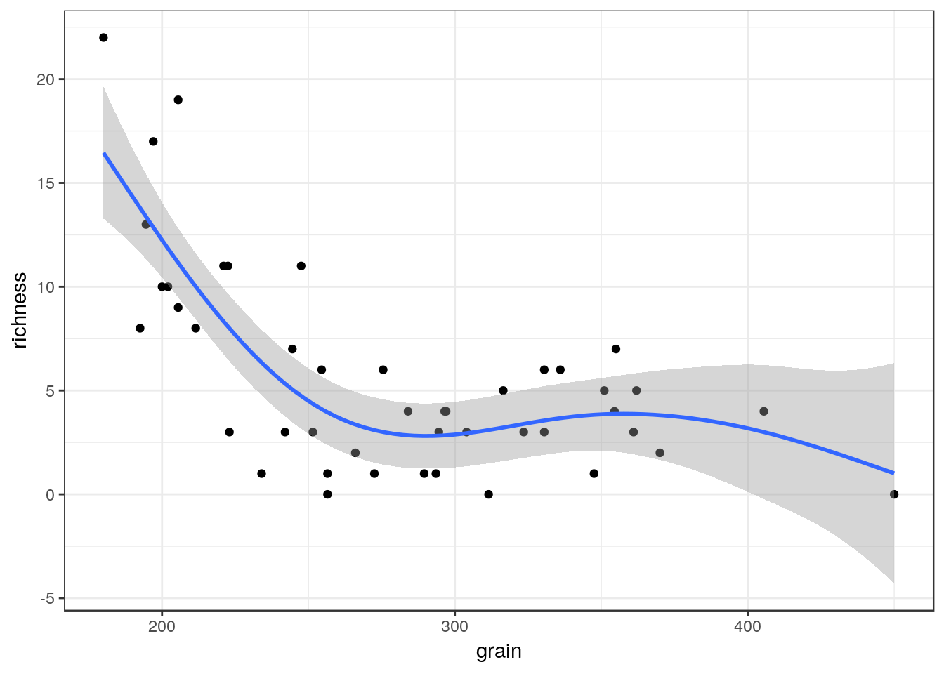
The plots can be arranged on a single page using the multiplot function taken from a cookbook for R.
multiplot(g1,g2,g3,g4,cols=2)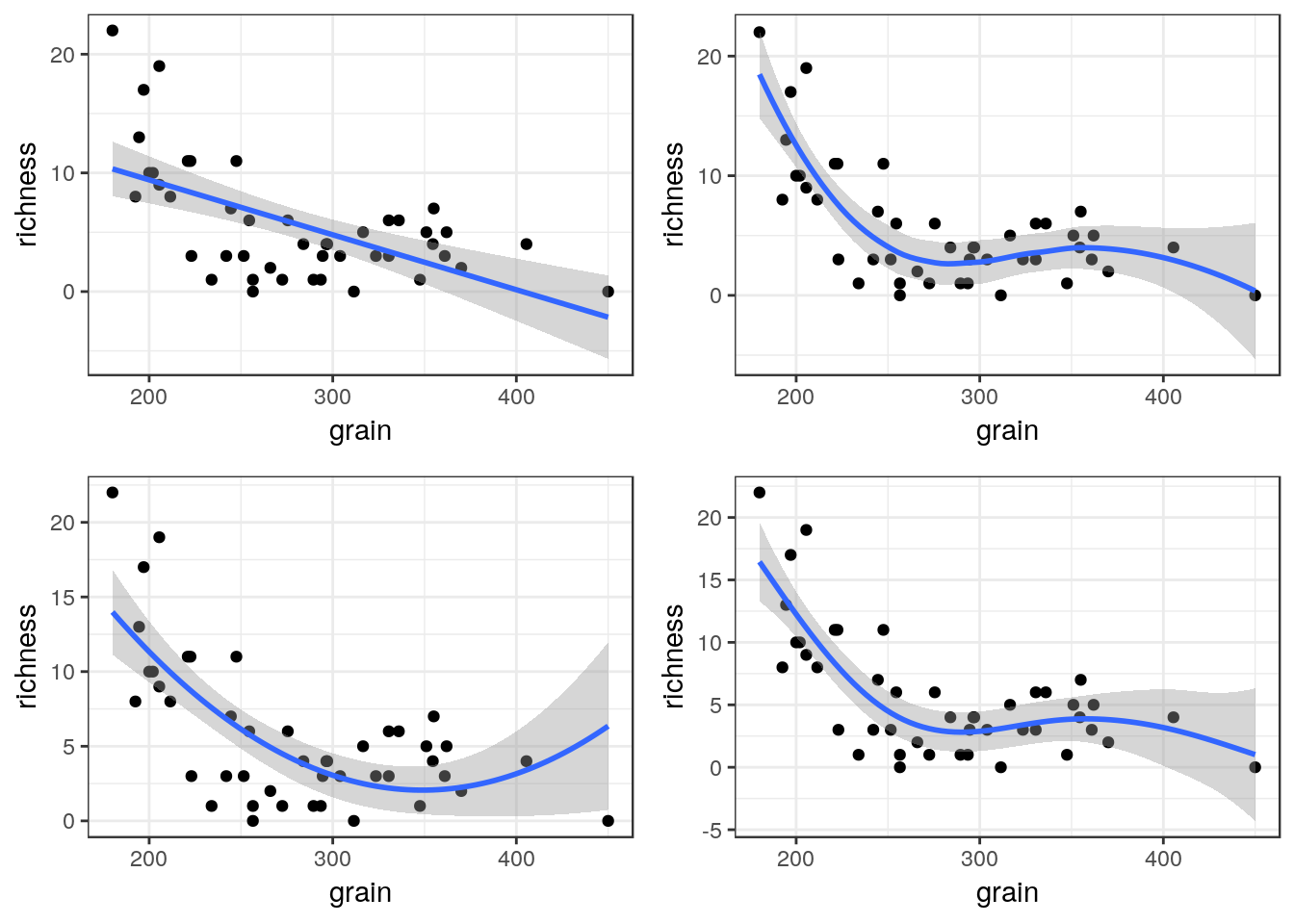
8.9 Generalised linear models
Ggplots conveniently show the results of prediction from a generalised linear model on the response scale.
glm1<-g0+geom_point()+geom_smooth(method="glm", method.args=list(family="poisson"), se=TRUE) +ggtitle("Poisson")
glm1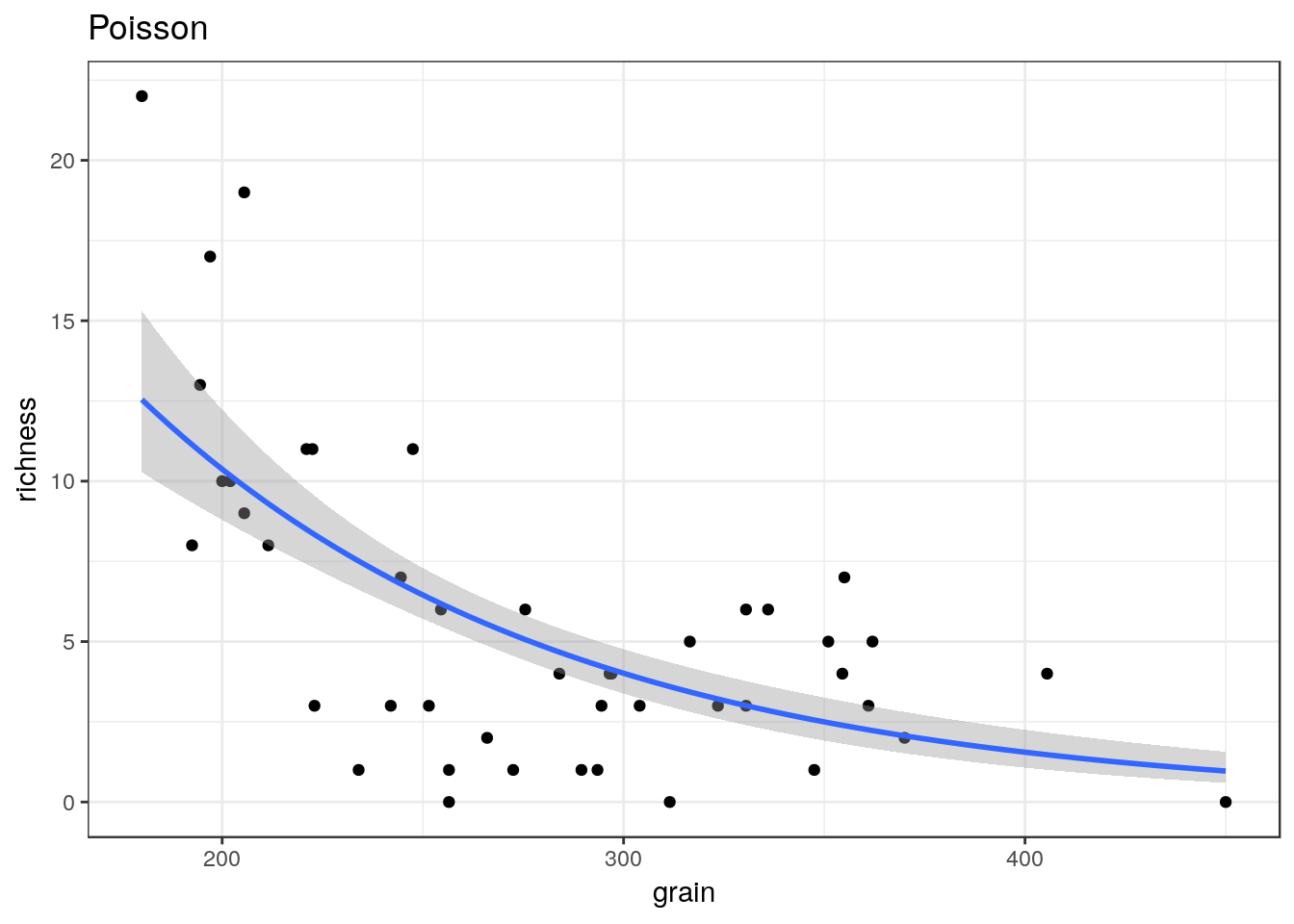
glm2<-g0+geom_point()+geom_smooth(method="glm", method.args=list(family="quasipoisson"), se=TRUE) + ggtitle("Quasipoisson")
glm2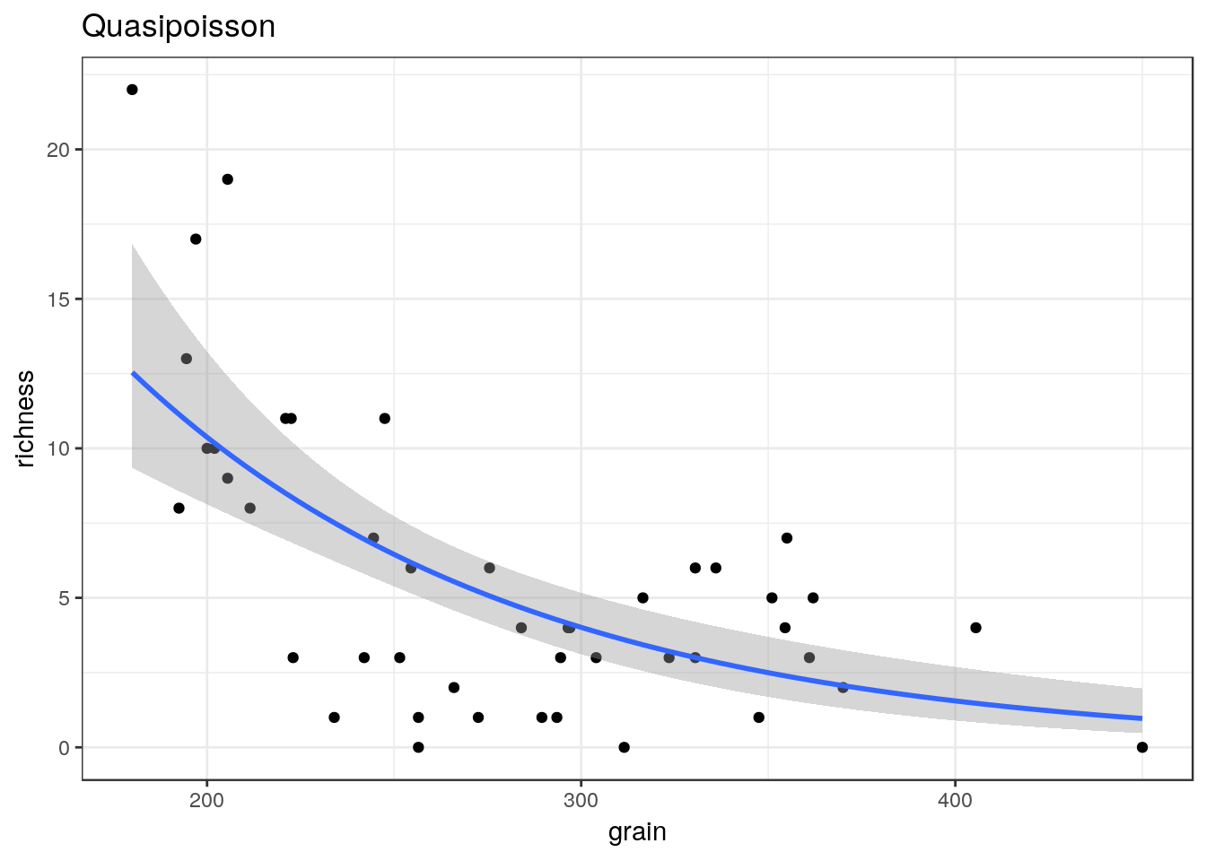
library(MASS)##
## Attaching package: 'MASS'## The following object is masked from 'package:plotly':
##
## select## The following object is masked from 'package:dplyr':
##
## selectglm3<-g0+geom_point()+geom_smooth(method="glm.nb", se=TRUE) +ggtitle("Negative binomial")
glm3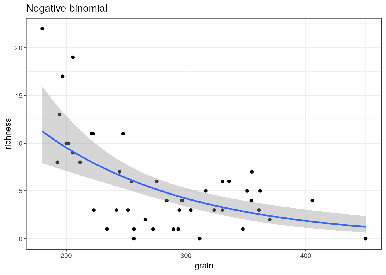
multiplot(glm1,glm2,glm3,cols=2)
8.10 Binomial data
The same approach can be taken to binomial data.
ragworm<-read.csv(system.file("extdata", "ragworm_test3.csv", package = "aqm"))
str(ragworm)
## 'data.frame': 100 obs. of 2 variables:
## $ presence: int 1 1 0 0 1 1 1 0 1 1 ...
## $ salinity: num 2.55 2.21 3.39 2.96 1.88 ...g0 <- ggplot(ragworm,aes(x=salinity,y=presence))
g1<-g0+geom_point()+stat_smooth(method="glm",formula = y~ x, method.args=list(family="binomial"))+ggtitle("Linear")
g2<-g0+geom_point()+stat_smooth(method="glm",formula = y~ x+I(x^2), method.args=list(family="binomial"))+ggtitle("Polynomial")
g3<-g0+geom_point()+stat_smooth(method = "gam", formula = y ~ s(x), method.args=list(family="binomial"))+ggtitle("GAM")
multiplot(g1,g2,g3,cols=2)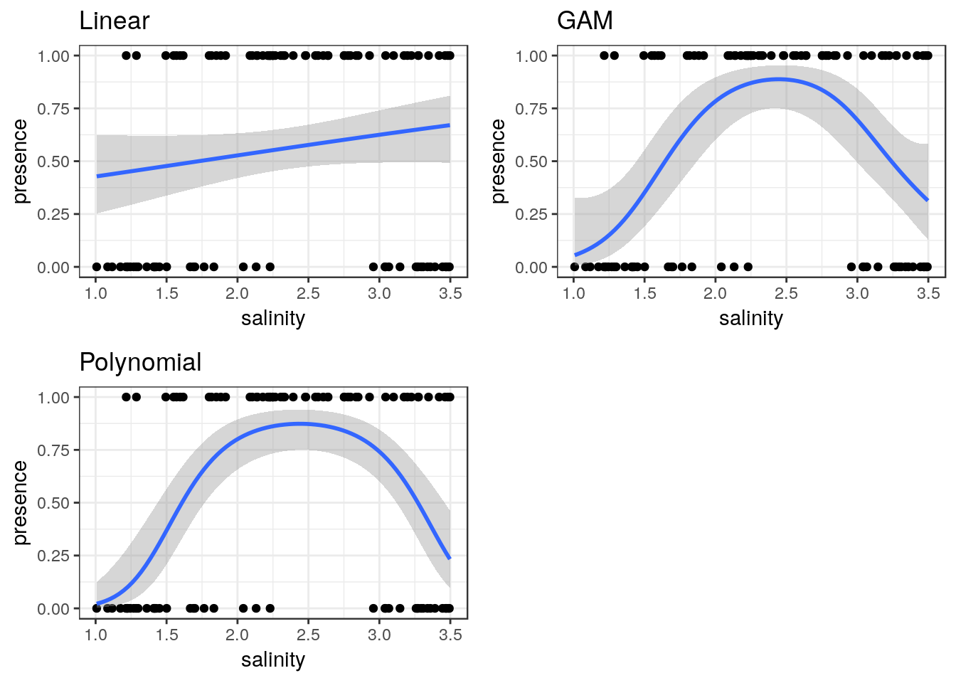
8.11 Learning more about ggplots
GGplots can be used to display very much more complex data sets than those shown in this handout.
A very useful resource if you want to try more advanced graphics is provided by the R cookbook pages.
http://www.cookbook-r.com/Graphs/
A detailed tutorial of gggplots is provided in chapter 3 of R for data science
https://r4ds.had.co.nz/data-visualisation.html
Some additional ideas are available here
http://r-statistics.co/Top50-Ggplot2-Visualizations-MasterList-R-Code.html
A flip book approach is taken here.
https://evamaerey.github.io/ggplot_flipbook/ggplot_flipbook_xaringan.html#23