Chapter 9 Simple bar charts
The simplest figures of all are probably barcharts.
Barcharts are used when the data consist of counts or percentage. Sometimes barcharts have been used to show means. These sort of barcharts with confidence intervals are inferential and are also known as “dynamite charts”. Although they are still used in some publications dynamite plots are best avoided. We will retun to this issue, but you may want to have a quick look at http://emdbolker.wikidot.com/blog:dynamite
Genuine barcharts are non inferential. In other words no statistical tests are associated with them directly. They are simply used to display information.
Let’s look at the simplest case possible where barcharts may be used. At the end of Spetember 2019 a group of Bournemouth University students monitored the traffic on the roads around the campus. They provided data on the counts of different types of vehicles passing each hour. Here is their data as they summarised it.
data(butraffic)
dt(butraffic)
These very simple data have no replication at all. Therefore there is no possibility of conducting any form of inferential statistical analysis. Sometimes a Chi Squared goodness of fit test can be used to test whether there is a significant difference between counts in each group, but this would clearly not be appropriate in this case as the differences are very apparent. However we can show the results to the reader more clearly through a figure than a table.
To form a standard barchart in gglots we first need to decide how the data will be mapped onto the elements that make up the plot. The term for this in ggplot speak is “aesthetics”- Personally I find the term aestehetics to represent mapping a bit misleading. I would instinctively assume that aesthetics refers to the colour scheme or other visual aspect of the final plot. In fact the aesthetics are the first thing to decide on, rather than the last.
The way to build a ggplot is by first forming an invisible object which represents the mapping of data onto the page. The way these data are presented can then be changed through adding differnt geometries. The only aesthetics (mappings) that you need to know about for basic usage are x,y, colour, fill, group and label. The x and y mappings coincide with axes, so are simple enough. Remember that a histogram maps onto the x axis. The y axis shows either frequency or density so is not mapped directly as a variable in the data.
The variable on the x axis in this case would be the Vehicle type. The count of the number of vehicles would be placed on the y axis. If we want to label the figure with the actual number counted (which is good practice for barcharts if feasible) we could add a label aesthetic as well.
g0<-ggplot(butraffic,aes(x=Vehicle,y=Count, label=Count)) Now let’s plot out the barplot. We do that by adding a geometry. There are two geometries that could be used heere. The simplest in this case is to use geom_col and add the label. We’ll assign the result to g1, then type the name g1 to plot it. That way if we want to continue modifying our plot we just add to g1.
g1<- g0 + geom_col() + geom_label()
# An alternative which does the same thing is geom_bar with identity stat.
# g1<- g0 + geom_bar(stat="identity") + geom_label()
g1
Note that if geom_bar is used then you need to tell R to use the “identity” stat if a table of counts is used. The default stat in this case is count, i.e. geom_bar itself will form a count table from raw data.
This figure looks OK, but it would be much clearer to have the bars in a ranked order.
To do this in R we use the follwing code. First tell R to arrange the data frame according to Count. To place in ascending order use -Count. Then a little trick is used to relevel the Vehicle factor levels to match the arrangement.
butraffic %>% arrange(-Count) %>%
  mutate(Vehicle = factor(Vehicle, Vehicle)) -> butraffic
We are going to have to set up the aesthetics again to use this, as the data have changed.
By default the background used for the first figure was grey. We can also change the look and feel of subsequent plots by setting the theme. A black and white theme might be better for printing.
theme_set(theme_bw())g0<-ggplot(butraffic,aes(x=Vehicle,y=Count, label=Count))
g1<- g0 + geom_col() + geom_label()
g1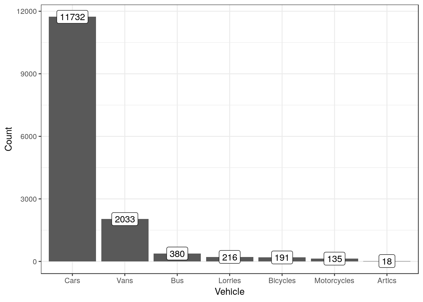
To show the results as percentages we can calculate them using another line of dplyr code.
butraffic %>% mutate(Percent=round(100*Count/sum(Count),1)) ->butraffic

g0<-ggplot(butraffic,aes(x=Vehicle,y=Percent, label=paste(Percent, "%", sep="")))
g2<-g0 + geom_col() + geom_label()
g2
9.1 Exercise
- The following code chunk produces the number of votes cast for each party in Bournemouth west.
data(ge2017)
ge2017 %>% filter(constituency=="Bournemouth West") %>% select(c("party","votes")) ->bw
## Adding missing grouping variables: `constituency`dt(bw)Form barcharts using both counts and percentages.
- The following code simulates responses to a question on the Likert scale
d<-data.frame(table(rand_likert()))
names(d)<-c("Resonse", "Count")
Form a barchart using these data.
Note that analysing a full questionaire would involve looking at the responses to many questions simultaneously.R has some additional graphical tools for this