Chapter 12 Advice on regression
12.1 Introduction
In the last class we looked at the theory underlying linear regression. To recap, there are three related reasons to use regression. The same analysis is used in all three cases, but different aspects of the output are emphasised in order to address the scientific question.
To calibrate some form of predictive model. This is most effective when a large proportion of the variance is explained by the regression line. For this to be effective we require reasonably high values of R² and emphasis falls on the form of the model and confidence intervals for the key parameter, which is the slope of the fitted line. This is a measure of how much the dependent variable (plotted on the y axis) changes with respect to each unit change in the independent variable (plotted on the x axis).
To investigate the proportion of variance “explained” by the fitted model. The R² value provides a measure of the variance explained. In the context of explanation this is the quantity that is emphasised. The R² value is a measure of how much scatter there is around the fitted relationship.
To test whether there is any evidence at all of a relationship. In this context the statistical significance provided by the p-value is the useful part of the output, in the context of rejecting the null hypothesis if no relationship at all (slope=0). If the sample size is small the evidence for a relationship will be weaker than with a large sample size. Low R² values (i.e. high levels of scatter) also make it more difficult to detect any evidence of a trend.
12.2 Predictive modelling: Calibration
If everything goes well you could be looking a very clear, linear trend with narrow confidence intervals. This may occur with morphological data where the width of some feature is closely related to the length, or in the context of some calibration experiment.
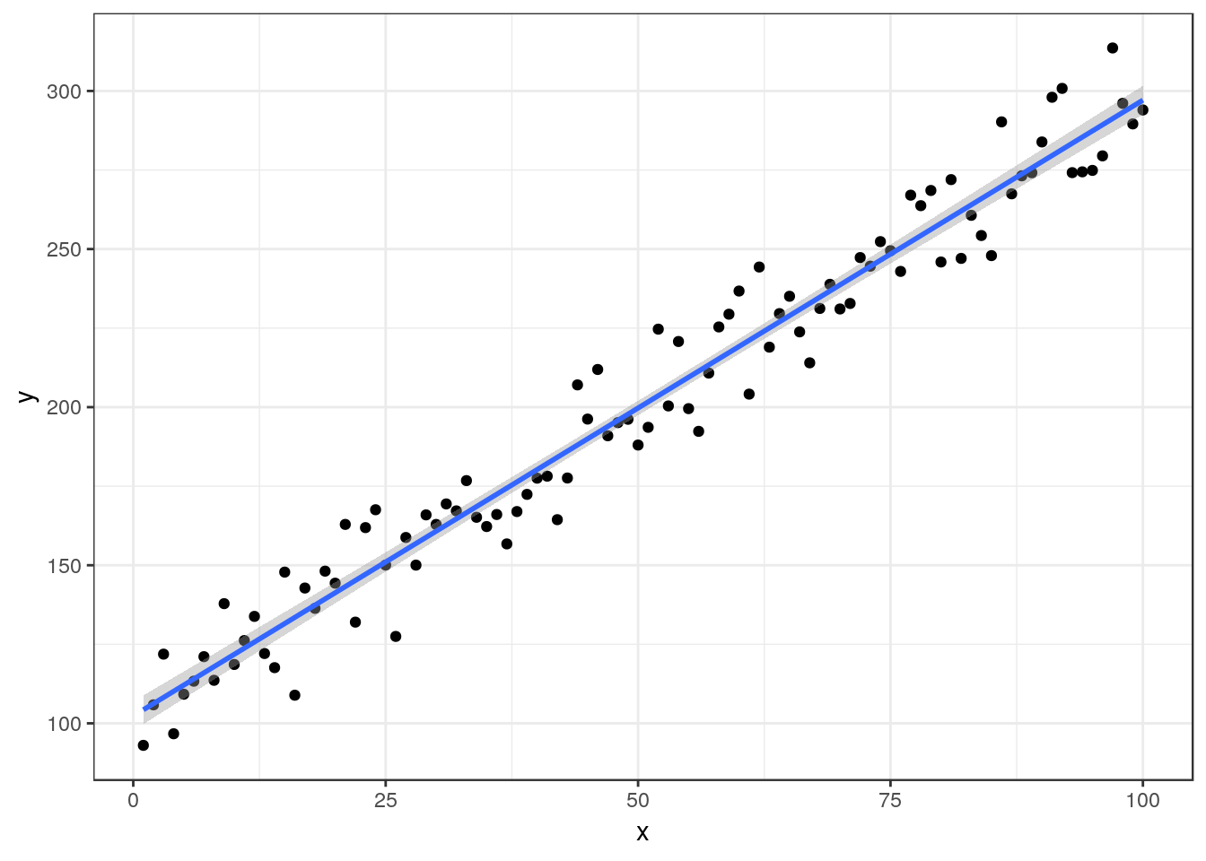
The estimated regression equation is Y= 102.34 + 1.95X, R² = 0.96 P-value < 0.001
12.2.1 Advice on writing up
In this situation you should concentrate your write up on interpreting the implications of the slope of the line. You have found a very clear relationship between x and Y. State this. Include the (narrow) confidence intervals for the parameters of the model. Discuss how the quantiative relationship may be used in research.
##                 2.5 %    97.5 %
## (Intercept) 97.719605 106.96516
## x            1.868064   2.02701
State the R² value and also make sure that you have clearly stated the sample size, defined the sample space and the methods used to measure the variables in the methods section. You should also state that the p-value was <0.001 but you don’t need to say very much about significance, as you are not interested in the probability that the data may be the result of chance when the scatterplot shows that the relationship is so clear cut. The important part of your discussion should revolve around the fitted line itself. You may suspect that the functional form for the relationship is not in fact a straight line. In future studies you might use nonlinear regression to model a response, but at this stage you do not yet know how to fit such models formally, so you should just discuss whether a straight line is appropriate.
12.3 Explanatory modelling:
In many situations the scatter around the line may be much greater that the previous case. This will lead to much less of the variance being explained by the underlying relationship. However there is still a clear relationship visible, providing the sample size is large enough.
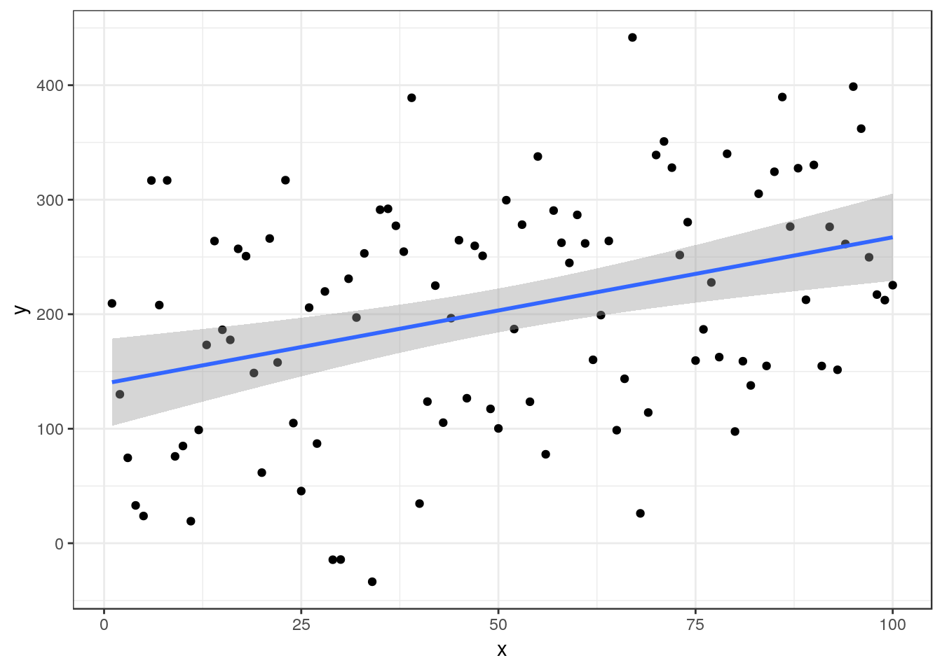
The estimated regression equation is Y= 139.36 + 1.28X, R² = 0.13 P-value < 0.001
12.3.1 Advice on writing up
In this situation the emphasis falls on the R² value, which here is comparatively low. You should state the p-value in order to confirm that the relationship is in fact significant. You should think about the reasons behind the scatter. It may be that the measurements themselves included a large amount of random error. However in ecological settings the error is more likely to be either simply unexplainable random noise, or some form of process error. The random noise around the line may in fact be associated with additional relationships with other variables which are not included in the simple model. This can be handled by multiple regression which uses more than one variable for prediction, and by a range of other techniques including modern machine learning. However these are more advanced, so you should concentrate on discussing how the model could be improved rather than finding ways to improve it at this stage.
It is always very important to discuss the sample size used in the study in all cases. Small samples may cause type 2 error. Type 2 error is a failure to reject the null hypothesis of no relationship even though there is some relationship there. It occurs when the sample size is too small to detect a relationship, even though one does in fact exist. Notice that we always fail to reject a null hypothesis. We do not state that there is no relationship. Instead we state that the study failed to provide evidence of a relationship.
12.4 Testing for a relationship
## Analysis of Variance Table
##
## Response: y
##           Df Sum Sq Mean Sq F value Pr(>F)
## x          1  23680   23680  1.8018 0.2163
## Residuals  8 105136   13142
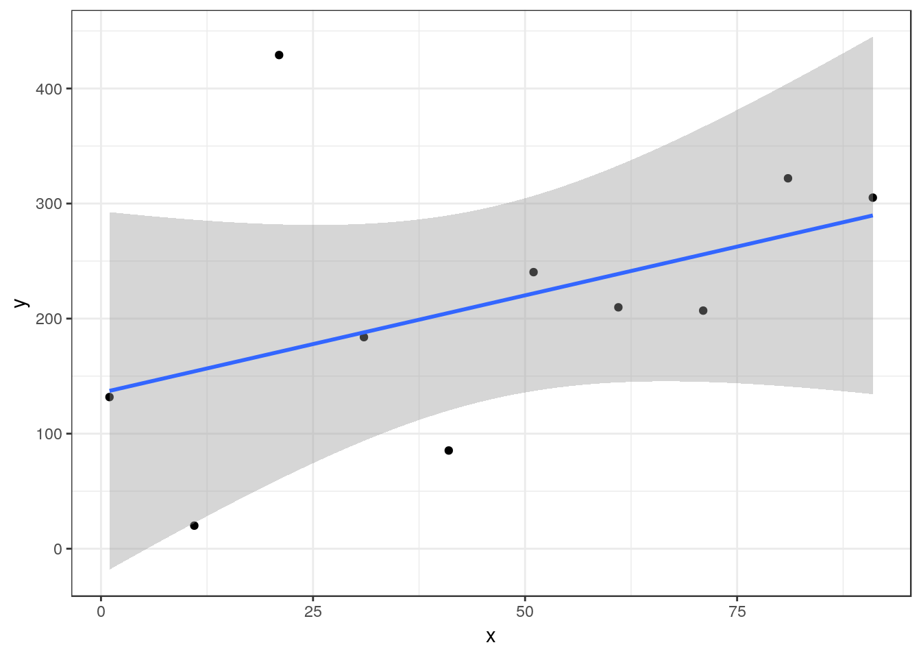
A smaller sample taken from the same sample space as the previous data set now does lead to an inconclusive study.
The estimated regression equation is Y= 135.5 + 1.69X, R² = 0.18 P-value = 0.216
12.4.1 Advice on writing up
In the case of a p-value over 0.05 you may want to note that there may be some indication of a relationship but that the results are statistically inconclusive. There is insufficient evidence provided by this particular study to confirm any relationship. The write up should emphasis the p-value and the study size. Include the F ratio 1.8 and the degrees of freedom of 1 on 8 . You should make suggestions regarding how future studies may be improved.
12.5 Diagnostics show assumptions not met
There are many ways in which the assumptions of regression are not met. This is why diagnostics are needed. You should look through the handout for the last class in order to understand this more deeply.
What do we do when assumptions are not met?
There is no simple answer to this. A large number of alternative techniques have been designed to analyse data that do not meet the assumptions used in regression. In this course we cannot look at all of them. So we need some simple rules that will help to make the best of the data without introducing a large number of new concepts.
12.6 Skewed independent variable
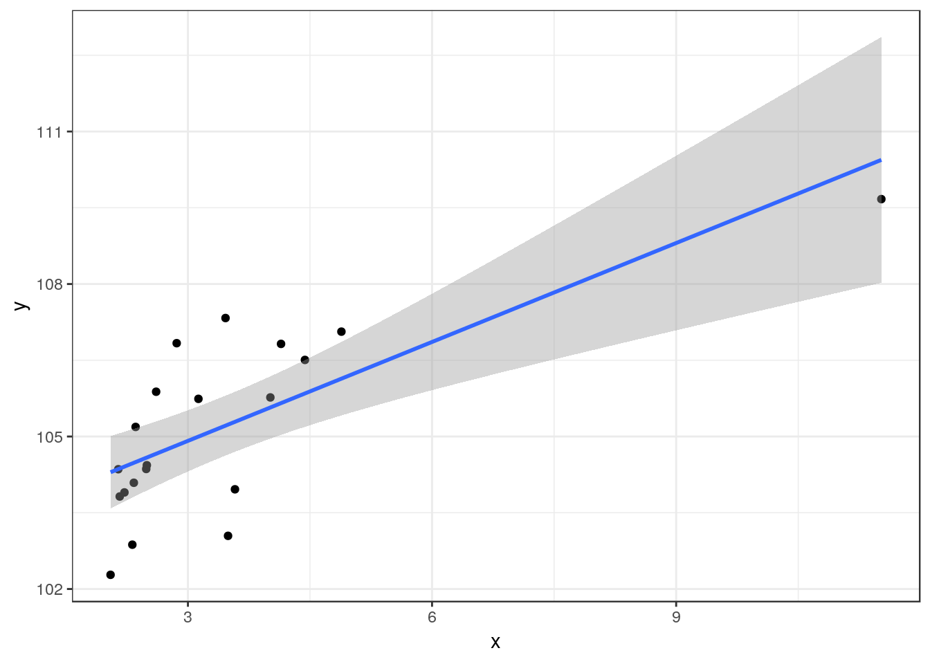
Sometimes the independent variable is heavily right skewed.
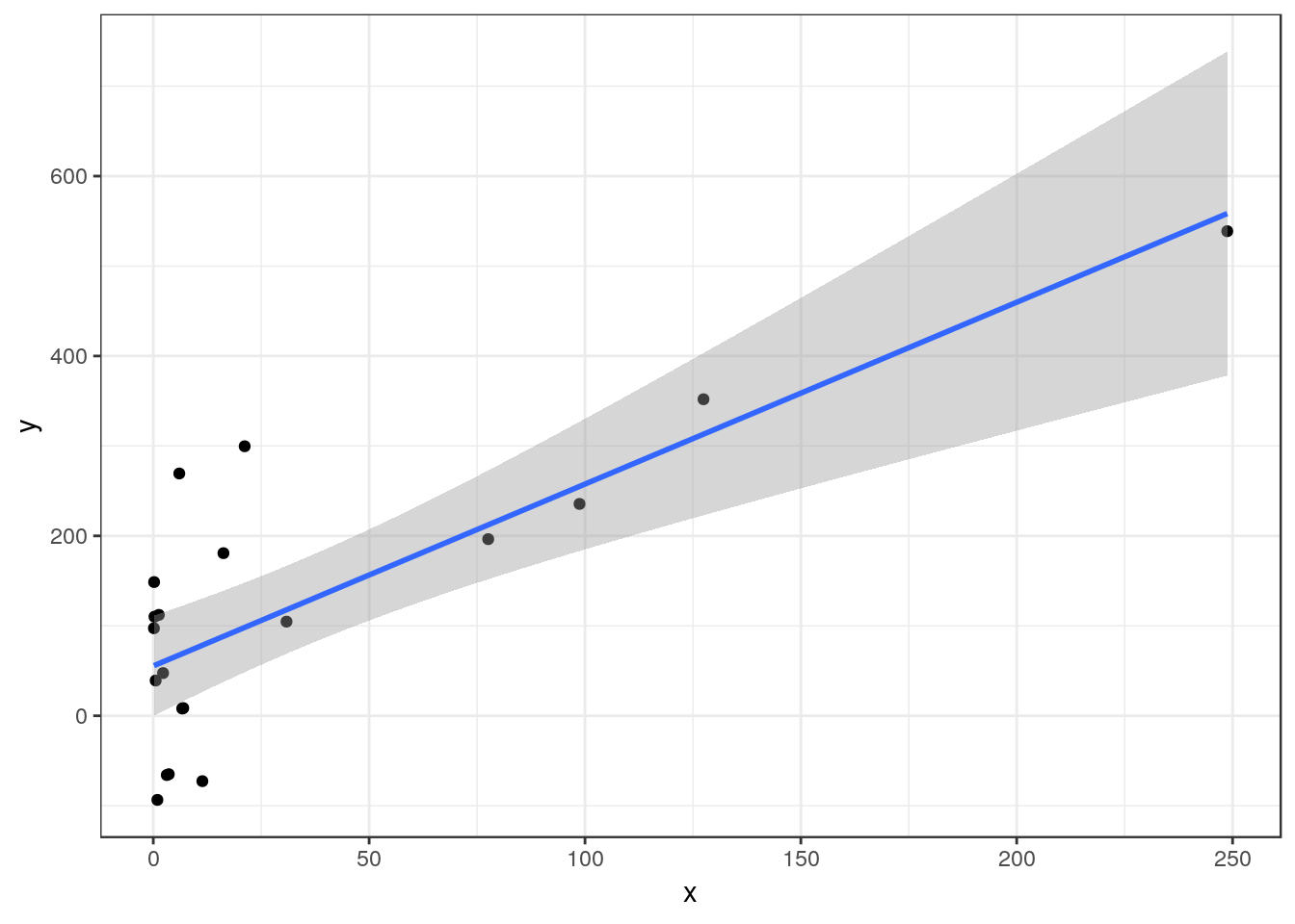
The estimated regression equation is Y= 55.42 + 2.02X, R² = 0.61 P-value < 0.001
Although you can still run a regression on data such as these, the diagnostic plots will show that many of the assumptions are not met. A common solution is to transform the independent variable by taking either the square root or the logarithm and then re-run the analysis.
d$logx<-log10(x)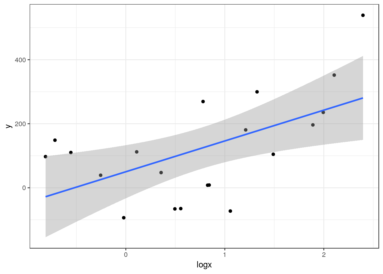
Now the regression looks much better and diagnostic plots will confirm that more assumptions are met.
The estimated regression equation is Y= 50.09 + 96.18log(X), R² = 0.32 P-value = 0.009
12.6.1 Advice on writing up
After a transformation you can write up the results in the same way that you would for any other regression model. However be careful how you interpret the slope and intercept given that you are now using a logarithmic scale.
12.7 Spearman’s rank correlation
A very simple non-parametric analysis is very commonly used when regression assumptions are not met. This is Spearman’s rank correlation.
12.7.1 Taking ranks
Instead of transforming the dependent variable we can take the ranks of both of the variables and use these in a regression.
d$rankx<-rank(d$x)
d$ranky<-rank(y)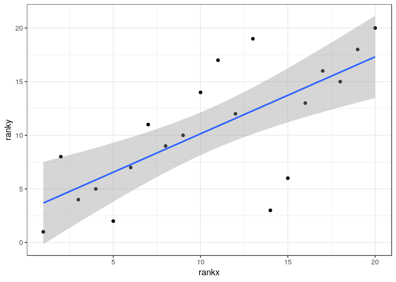
R² = 0.51 P-value < 0.001
12.7.2 Advice on writing up
Although the relationship between the ranked data can be shown on a scatter-plot with a fitted line, the slope and intercept of this line has little meaning. You therefore emphasise the R² value after noting that it refers to Spearmans rank correlation, not regression, and the p-value. A simple correlation test in R provides the p-value and the correlation coefficient (rho)
cor.test(d$y,d$x,method="spearman")##
## Spearman's rank correlation rho
##
## data: d$y and d$x
## S = 376, p-value = 0.0005407
## alternative hypothesis: true rho is not equal to 0
## sample estimates:
## rho
## 0.7172932So the value of rho is 0.72 and the R squared is 0.51
12.8 Non linear response
In many data sets the response may not follow a strictly linear trend. Take for example the yearly mean temperature data we looked at previously.
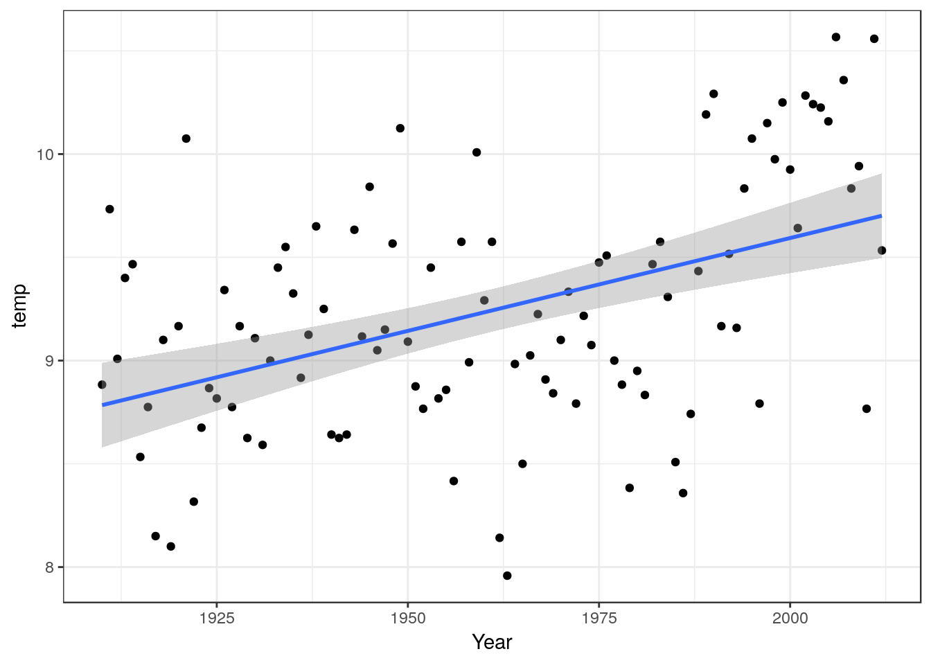
You can fit a linear model to these data and report the results.
The estimated regression equation is Y= -8.39 + 0.01log(X), R² = 0.21 P-value < 0.001
However if you look carefully at the scatter-plot and model diagnostics you will see that many of the points fall in clusters on either side of the line. This known as serial autocorrelation in the residuals. It is an indication that the model may be ill formed, in other words that a straight line may not be the best way to describe the underlying relationship.
One solution may be to use a non-linear smoother (note .. this is not the same as a non-linear model for a functional response). There are many forms of smoothers available. The theory behind their use can be quite complex, but in general terms they will tend to follow the empirical pattern in the response.
library(mgcv)
g0<-ggplot(TMean,aes(x=Year,y=temp))
g0 + geom_point() + geom_smooth(method="gam", formula =y~s(x))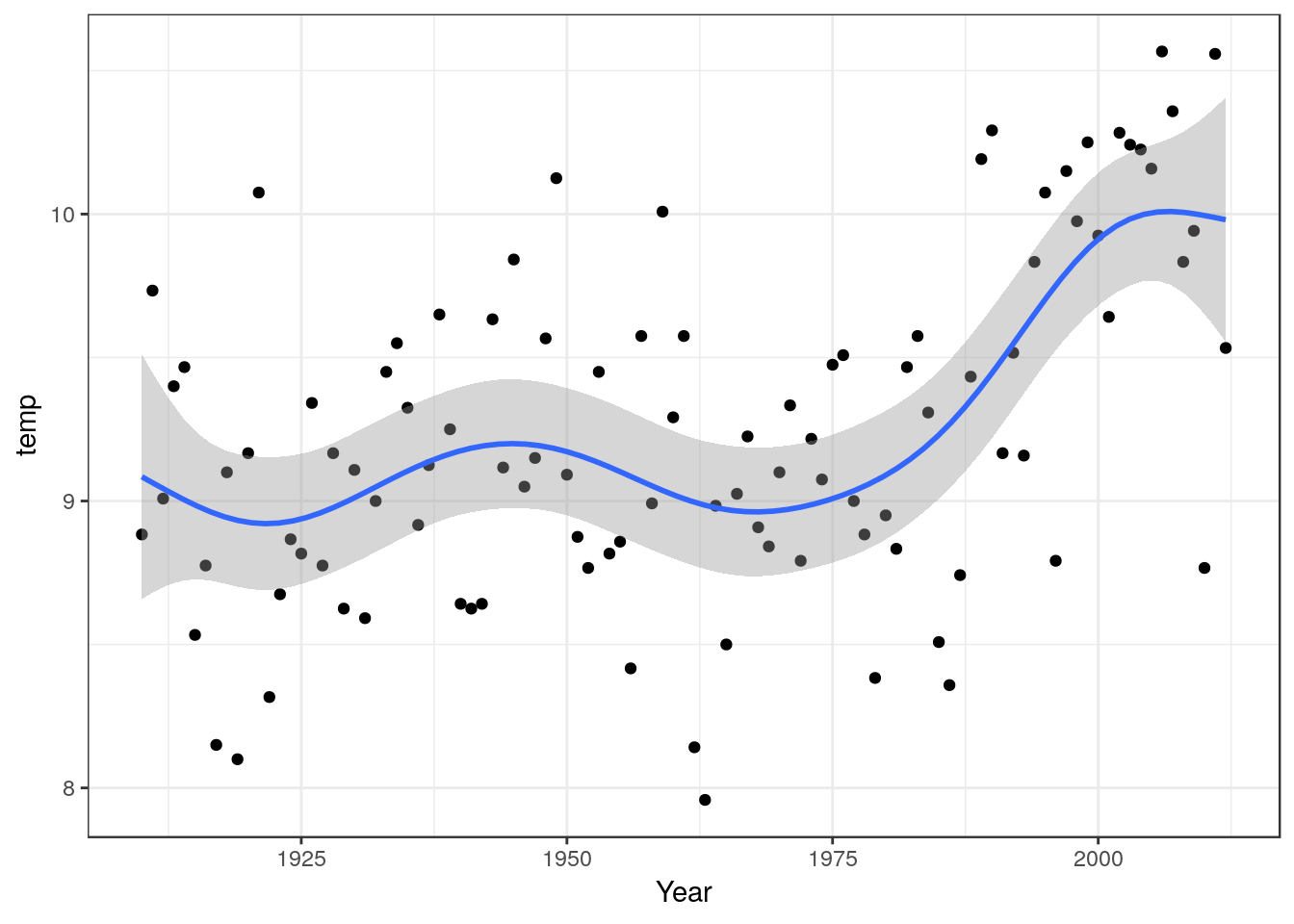
mod<-gam(data=TMean,temp~s(Year))
anova(mod)
##
## Family: gaussian
## Link function: identity
##
## Formula:
## temp ~ s(Year)
##
## Approximate significance of smooth terms:
## edf Ref.df F p-value
## s(Year) 5.885 7.044 8.14 5.07e-0812.8.1 Advice on writing up
In this case you need to discuss the pattern of the response as shown in the scatter-plot with fitted spline. The significance of the overall model can be quoted, but the emphasis falls on the shape of the response and “local” features such a break points and changes in slope.
In this case not how there was a very clear linear trend between 1975 and 2010. There was a short period of slight cooling between 1940 and 1975. In a data set with very interpretable single values such as this one you may want to mention extremely cool and warm years explicitly.