Chapter 11 Using regression
11.1 Introduction
We have now seen how t-tests can be used to look for reproducible differences between the means of two sets of measurements. We have extended this to look at differences between multiple groups of measurements using one way ANOVA.
Both these techniques require one of the variables to be numeric (the measurements) and the second variable to be categorical (a character vector which can be coerced to a factor). In both cases we can use boxplots to look at the data and plots of means with confidence intervals to draw inferences.
The questions asked from a statistical perspective involve differences between groups. The results can then be carefully evaluated from a scientific perspective. In the case of planned experiments a statistical hypothesis test has a direct interpretation. A p-value below 0.05 conventionally allows us to reject the null hypothesis of no difference and state that statistically significant differences were detected. In the case of observational data we can reach the same conclusion, but need to be more cautious when interpreting it. To understand the importance of any differences we need to look at the effect size and associated confidence intervals.
In many cases we want to look at the relationship between two numerical variables. When such data is visualised it forms a scatterplot. There are many different ways of modelling such data. The simplest is linear regression.
11.2 Regression as a statistical model
Statistical modelling generally allows you to extract more information from your data than some simpler “test” based methods that you may have learned previously. Most contemporary papers in ecology use models of some kind. Even if the nature of the data you collect limits your options, it is very important to learn to fit and interpret statistical models in order to follow their presentation within the literature.
11.3 What is a statistical model?
To some extent statistical modelling is easier than other forms of ecological modelling. Building process based models requires a great deal of understanding of a system. Statistical models are built from the data themselves. Providing you do have some data to work with you can let the combination of data and pre-built algorithms find a model. However there are many issues that make statistical modelling challenging.
A statistical model is a formal mathematical representation of the “sample space”", in other words the population from which measurements could have been drawn. It has two components.
- An underlying “deterministic”" component, that usually represents a process of interest.
- A stochastic component representing “unexplained” variability
So, a statistical model effectively partitions variability into two parts. One part represents some form of potentially interesting relationship between variables. The other part is just “random noise.” Because statistics is all about variability, the “noise” component is actually very important. The variability must be looked at in detail on order to decide on the right model. Many of the challenges involved in choosing between statistical models involves finding a way to “explain” the “unexplained” variability. This fundamental contradiction is why statistical concepts are so hard to understand.
11.4 Uses of models
The literature on statistical modelling frequently uses the terms “explanation” and “prediction” to describe the way models are used. Although the same model can have both roles, it is worth thinking about the difference between them before fitting and interpreting any models.
11.4.1 Prediction
Models can be used to predict the values for some variable when we are given information regarding some other variable upon which it depends. An example is a calibration curve used in chemistry. We know that conductivity and salinity are directly related. So if we measure the conductivity of liquids with known salinities we can fit a line. We can then use the resulting model to predict salinity at any point between the two extremes that we used when finding the calibration curve. Notice that we cannot easily extrapolate beyond the range of data we have. We will see how the same concept applies to the models we use in quantitative ecology.
Predictions are more reliable if a large portion of the variability in the data can be “explained” through relationships with other variables. The more random variability in the data, the more difficult prediction becomes.
11.4.2 Explanation
The idea that the variability in the data can be “explained” by some variable comes from the terminology that was used when interpretating experimental data. Experiments usually involve a manipulation and a control of some description. If values for some response differ between control and intervention then it is reasonable to assume that the difference is “explained” by the intervention. If you wish to obtain data that are simple to analyse and interpret you should always design an experiment. However, experiments can be costly. Ecological systems are often slow to respond to interventions, making experiments impossible within the time scale of a master’s dissertation. We are often interested in systems that cannot be easily modified anyway on ethical or practical grounds. Thus in ecology we often have to interpret associations between variables as evidence of process that “explain” a relationship. Correlation is not causation. Although patterns of association can provide insight into causality they are not enough to establish it. So, when you read the words “variance explained” look carefully at the sort of data that are being analysed. In an ecological setting this may only suggest close association between variables, not a true explanation in the everyday sense of the word.
When there is a great deal of variability in the data we may want to ask whether any of the variability at all is “explained” by other variables. This is where statistical tests and p-values have a purpose. When faced with small amounts of noisy data it can be useful simply to ask whether more variability is associated with some variable than would occur by chance.
11.5 The general linear model
General linear models lie behind a large number of techniques. These have different names depending on the type of data used to explain or predict the variability in a numerical response variable.
- Regression (Numerical variable)
- Analysis of variance (One or more categorical variables)
- Analysis of covariance (Categorical variable plus numerical variable)
- Multiple regression (Multiple numerical variables)
Although these analyses are given different names and they appear in different parts of the menu in some software (e.g SPSS), they are all based on a similar mathematical approach to model fitting. In R the same model syntax is used in all cases. The steps needed to build any linear model are…
- Look at the data carefully without fitting any model. Try different ways of plotting the data. Look for patterns in the data that suggest that they are suitable for modelling.
- Fit a model: The standard R syntax for a simple linear regression model is mod<-lm(y~x) However model formulae may be much more complex.
- Look at whether the terms that have been entered in the model are significant: The simplest R syntax is anova(mod). Again, this part of the process can be become much more involved in the case of models with many terms.
- Summarise the model in order to understand the structure of the model. This can be achieved with summary(mod)
- Run diagnostics to check that assumptions are adequately met. This involves a range of techniques including statistical tests and graphical diagnoses. This step is extremely important and must be addressed carefully in order to ensure that the results of the exercise are reliable.
This all may seem very complicated, and it is. If you carry on to take the AQM unit we will return to all these concepts in more depth in order to find out why more complex models are necessary. For the moment the important element is how to use regression for the practical purpose of addressing scientific questions.
11.6 The theory behind regression
The regression equation is ..
\(y=a+bx+\epsilon\) where \(\epsilon=N(o,\sigma^{2})\)
In other words it is a straight line with a as the intercept, b as the slope, with the assumption of normally distributed errors (variability around the line)
The diagram below taken from Zuur et al (2007) illustrates the basic idea. In theory, if we had an infinite number of observations around each point in a fitted model, the variability would form a perfect normal distribution. The shape and width of the normal curves would be constant along the length of the model. These normal curves form the stochastic part of the model. The straight line is the deterministic part. This represents the relationship we are usually most interested in. The line is defines by its intercept with the axis and its slope.

For any observed value of y there will be a fitted value (or predicted value) that falls along the line. The difference between the fitted value and the observed value is known as the residual.

In reality we do not have infinite observed values at each point. However if we collected all the residuals together we should get a normal distribution.
11.7 Practical uses of regression
Do not attempt to run through any of the code shown here yourself. This section is an illustration of the concepts involved in running and interpreting a regression. The code, as shown, hides some of the chunks that generated the illustrative data. So the code will not run without data.
It is not really necessary to understand every aspect underlying the theory of fitting a regression line in order to use the technique. There are three related reasons to use regression. The same analysis is used in all three cases, but different aspects of the output are emphasised in order to address the scientific question.
The important elements that can be produced through regression in all cases are:
- The slope of the line. This indicates how much a unit change in x changes the fitted value of y.
- R². This is a measure of the signal to noise ratio. If the scatter falls along a perfectly straight line it will be 1. This never happens in practice. The lower the value of R² the greater the scatter around the line.
- The p-value. This is a test statistic that simply confirms that the pattern in the scatterplot is unlikely to have been the result of chance under the null hypothesis of no relationship between the variable.
There are three basic uses of regression.
To calibrate some form of predictive model. This is most effective when a large proportion of the variance is explained by the regression line. For this to be effective we require reasonably high values of R². The emphasis falls on the form of the model and confidence intervals for the key parameter, which is the slope of the fitted line. This is a measure of how much the dependent variable (plotted on the y axis) changes with respect to each unit change in the independent variable (plotted on the x axis). This will become apparent through an example.
To investigate the proportion of variance “explained” by the fitted model. The R² value provides a measure of the variance explained. In the context of explanation this is the quantity that is emphasised. The R² value is a measure of how much scatter there is around the fitted relationship.
To test whether there is any evidence at all of a relationship. In this context the statistical significance provided by the p-value is the useful part of the output, in the context of rejecting the null hypothesis if no relationship at all (slope=0). If the sample size is small the evidence for a relationship will be weaker than with a large sample size. Low R² values (i.e. high levels of scatter) also make it more difficult to detect any evidence of a trend.
To look at regressions with differing sample sizes and “noise to signal” ratio you can use this shiny app.
http://r.bournemouth.ac.uk:8790/stats/oak_leaves/scatterplot/
11.8 Predictive modelling: Calibration
If everything goes well you could be looking a very clear, linear trend with narrow confidence intervals. This may occur with morphological data where the width of some feature is closely related to the length, or in the context of some calibration experiment.
11.8.1 Plotting the model
Assuming you have a dataframe with a variable called x and another called y.
g0<-ggplot(d,aes(x=x,y=y))
g0 + geom_point() +geom_smooth(method="lm")
11.8.2 Summarising the model
The model is fitted and summarised using this code.
mod<-lm(data=d,y~x)
summary(mod)
##
## Call:
## lm(formula = y ~ x, data = d)
##
## Residuals:
## Min 1Q Median 3Q Max
## -25.495 -7.885 -1.291 7.528 22.340
##
## Coefficients:
## Estimate Std. Error t value Pr(>|t|)
## (Intercept) 102.34238 2.32948 43.93 <2e-16 ***
## x 1.94754 0.04005 48.63 <2e-16 ***
## ---
## Signif. codes: 0 '***' 0.001 '**' 0.01 '*' 0.05 '.' 0.1 ' ' 1
##
## Residual standard error: 11.56 on 98 degrees of freedom
## Multiple R-squared: 0.9602, Adjusted R-squared: 0.9598
## F-statistic: 2365 on 1 and 98 DF, p-value: < 2.2e-16You should be able to look at this output and write a line that looks like this.
The estimated regression equation is y= 102.34 + 1.95x, R² = 0.96 P-value < 0.001
11.8.3 Diagnostic checks
The performance library provides a simple way of running visual diagnostic checks. (Lüdecke et al. 2021).
performance::check_model(mod)
The figure provides some textual advice on what to look for. The assumptions do not all need to be met precisely. When sample sizes are small it may be difficult to spot any violations of the assumptions as the figures will be not very well formed. It may be particularly hard to see if the distribution of the residuals is approximately normal. The QQplot may be the best tool for this.
performance::check_model(mod, check="qq")
Note that although the dots do not fall cleanly along the line they do fall within the confidence intervals. No major violation here. Also although the assumption of normally distributed residuals is a formal necessity for regression, minor violations are generally unimportant.
Do remember that the assumption of normality applies only to the residuals of the model,not to the data themselves. The rationale for looking at the distribution of the data is to check whether any transformations are required to give the data better statistical properties, not to check the assumptions used when fitting the statistical model itself (Zuur, Ieno, and Elphick 2009)
11.8.4 Advice on writing up
In this situation you should concentrate your write up on interpreting the implications of the slope of the line. You have found a very clear relationship between x and Y. State this. Mention that diagnostic checks showed no violations of the assumptions needed for linear regression. Include the (narrow) confidence intervals for the parameters of the model. Discuss how the quantitative relationship may be used in research.
Remember that the slope represents the change in the value of y for every unit change in x. This can be an important parameter and it does have confidence intervals.
confint(mod)## 2.5 % 97.5 %
## (Intercept) 97.719605 106.96516
## x 1.868064 2.02701State the R² value and also make sure that you have clearly stated the sample size, defined the sample space and the methods used to measure the variables in the methods section. You should also state that the p-value was <0.001 but you don’t need to say very much about significance, as you are not interested in the probability that the data may be the result of chance when the scatterplot shows that the relationship is so clear cut. You can mention that diagnostic checks were conducted using the performance package (Lüdecke et al. 2021) in R (R Core Team 2020a). The important part of your discussion should revolve around the fitted line itself. You may suspect that the functional form for the relationship is not in fact a straight line. In future studies you might use nonlinear regression to model a response, but at this stage you do not yet know how to fit such models formally, so you should just discuss whether a straight line is appropriate. If the slope has a clear interpretation and scientific relevance then discuss the value, with mention of the confidence interval.
11.9 Explanatory modelling:
In many situations the scatter around the line may be much greater that the previous case. This will lead to much less of the variance being explained by the underlying relationship. However there is still a clear relationship visible, providing the sample size is large enough.

anova(mod)## Analysis of Variance Table
##
## Response: y
## Df Sum Sq Mean Sq F value Pr(>F)
## x 1 211921 211921 22.135 8.344e-06 ***
## Residuals 98 938269 9574
## ---
## Signif. codes: 0 '***' 0.001 '**' 0.01 '*' 0.05 '.' 0.1 ' ' 1summary(mod)##
## Call:
## lm(formula = y ~ x, data = d)
##
## Residuals:
## Min 1Q Median 3Q Max
## -213.79 -82.98 15.97 67.12 302.88
##
## Coefficients:
## Estimate Std. Error t value Pr(>|t|)
## (Intercept) 121.895 19.717 6.182 1.46e-08 ***
## x 1.595 0.339 4.705 8.34e-06 ***
## ---
## Signif. codes: 0 '***' 0.001 '**' 0.01 '*' 0.05 '.' 0.1 ' ' 1
##
## Residual standard error: 97.85 on 98 degrees of freedom
## Multiple R-squared: 0.1842, Adjusted R-squared: 0.1759
## F-statistic: 22.13 on 1 and 98 DF, p-value: 8.344e-06The estimated regression equation is Y= 121.9 + 1.59X, R² = 0.18 P-value < 0.001
Note that there are no major violations of the assumptions for running a regression. The issue is that the relationship is not very strong. There is comparatively small signal to noise ratio as shown by the \(R^2\) value.
check_model(mod)
11.9.1 Advice on writing up
In this situation the emphasis falls more on the R² value, which here is comparatively low. You should state the p-value in order to confirm that the relationship is in fact significant. You should think about the reasons behind the scatter. It may be that the measurements themselves included a large amount of random error. However in ecological settings the error is more likely to be either simply unexplainable random noise, or some form of process error. The random noise around the line may in fact be associated with additional relationships with other variables which are not included in the simple model. This can be handled by multiple regression which uses more than one variable for prediction, and by a range of other techniques including modern machine learning. However these are more advanced, so you should concentrate on discussing how the model could be improved rather than finding ways to improve it at this stage.
It is always very important to discuss the sample size used in the study in all cases. Small samples may cause type 2 error. Type 2 error is a failure to reject the null hypothesis of no relationship even though there is some relationship there. It occurs when the sample size is too small to detect a relationship, even though one does in fact exist. Notice that we always fail to reject a null hypothesis. We do not state that there is no relationship. Instead we state that the study failed to provide evidence of a relationship.
11.10 Testing for a relationship
In some cases there does not appear to be any relationship at all between the variables. This often arises if the sample is small and/or the underlying relationship is very weak or genuinely non-existent. In this case the p-value does become important as it allows us to check whether the sample is able to suggest that at least some relationship may be present, even if it is weak.

This was a smaller sample taken from the same sample space as the previous data set. As a result of the reduced sample the analysis this time leads to an inconclusive result
anova(mod)## Analysis of Variance Table
##
## Response: y
## Df Sum Sq Mean Sq F value Pr(>F)
## x 1 67777 67777 4.798 0.05988 .
## Residuals 8 113009 14126
## ---
## Signif. codes: 0 '***' 0.001 '**' 0.01 '*' 0.05 '.' 0.1 ' ' 1summary(mod)##
## Call:
## lm(formula = y ~ x, data = d)
##
## Residuals:
## Min 1Q Median 3Q Max
## -140.838 -80.310 3.138 43.151 178.181
##
## Coefficients:
## Estimate Std. Error t value Pr(>|t|)
## (Intercept) 125.828 70.963 1.773 0.1141
## x 2.866 1.309 2.190 0.0599 .
## ---
## Signif. codes: 0 '***' 0.001 '**' 0.01 '*' 0.05 '.' 0.1 ' ' 1
##
## Residual standard error: 118.9 on 8 degrees of freedom
## Multiple R-squared: 0.3749, Adjusted R-squared: 0.2968
## F-statistic: 4.798 on 1 and 8 DF, p-value: 0.05988The estimated regression equation is Y= 125.83 + 2.87X, R² = 0.37 P-value = 0.06
Note that there are no major violations of the assumptions for running a regression. The issue is that the relationship is not clear.
check_model(mod)
11.10.1 Advice on writing up
In the case of a p-value over 0.05 you may want to note that there may be some indication of a relationship but that the results are statistically inconclusive. There is insufficient evidence provided by this particular study to confirm any relationship. The write up should emphasis the p-value and the study size. Include the F ratio 4.8 and the degrees of freedom of 1 on 8 . You should make suggestions regarding how future studies may be improved.
11.11 Diagnostics show assumptions not met
There are many ways in which the assumptions of regression are not met. This is why diagnostics are needed. The full implications of this will be looked at in the AQM unit. At this stage just be aware that assumptions are important, but don’t be too concerned with them when writing up the assignment. We can discuss this in the class.
What do we do when assumptions are not met?
There is no simple answer to this. A large number of alternative techniques have been designed to analyse data that do not meet the assumptions used in regression. In this course we cannot look at all of them. So we need some simple rules that will help to make the best of the data without introducing a large number of new concepts.
11.12 Skewed independent variable
Sometimes the independent variable is heavily right skewed.

The estimated regression equation is Y= 115.04 + 2.01X, R² = 0.46 P-value = 0.001
Although you can still run a regression on data such as these, the diagnostic plots will show that many of the assumptions are not met.
check_model(mod)
A common solution is to transform the independent variable by taking either the square root or the logarithm and then re-run the analysis.
d$logx<-log10(x)
Now the regression looks somewhat better and diagnostic plots will confirm that more assumptions are met.
The estimated regression equation is Y= 101.51 + 42.9log(X), R² = 0.54 P-value < 0.001

11.12.1 Advice on writing up
After a transformation you can write up the results in the same way that you would for any other regression model. However be careful how you interpret the slope and intercept given that you are now using a logarithmic scale.
11.13 Spearman’s rank correlation (not generally recomended)
A very simple non-parametric analysis is very commonly used when regression assumptions are not met. This is Spearman’s rank correlation. As it is so widely used its included here. However either data transformations or the “line and spline” technique shown later are generally much more useful.
Although Spearman’s rank correlation can occasionally be useful, it is not a parametric procedure, so would be only used if nothing else is available. It can be very useful as an input to some multivariate models. It can also be the “go to” technique for very small data sets when the only question of interest is whether some relationship can be detected. The best feature of taking ranks is that it down weights data points with high leverage (outliers at the extremes)

11.13.1 Taking ranks
Spearman’s correlation essentially takes the ranks of both of the variables and uses these in a regression. However the procedure does not provide an equation. There are some rather limited circumstances when an actual regression model based on ranks would be useful. This is essentially a non parametric procedure and should only be used if nothing else is possible (Johnson 1995)
d$rankx<-rank(d$x)
d$ranky<-rank(y)
R² = 0.82 P-value < 0.001
11.13.2 Advice on writing up
Although the relationship between the ranked data can be shown on a scatter-plot with a fitted line, the slope and intercept of such a line usually has little meaning. You therefore just emphasise the R² value after noting that it refers to Spearmans rank correlation, not regression, and the p-value. A simple correlation test in R provides the p-value and the correlation coefficient (rho)
cor.test(d$y,d$x,method="spearman")##
## Spearman's rank correlation rho
##
## data: d$y and d$x
## S = 1942, p-value < 2.2e-16
## alternative hypothesis: true rho is not equal to 0
## sample estimates:
## rho
## 0.9067467So the value of rho is 0.91 and the R squared is 0.82
A better approach may be to use a non linear smoother. See below for an example of how to do this.
11.14 The “line and spline” approach to non linear trends.
The term “line and spline” is my own invention and is not in the text books. So don’t use it in a formal write up. However it is an approach I very strongly suggest that you adopt yourself.In many data sets the response may not follow a strictly linear trend (as the above examples). So much so that it almost the default in observational data sets.
Take for example the yearly mean temperature data for the UK.

You can fit a linear model to these data and report the results.
mod<-lm(data=TMean,temp~Year)
summary(mod)
##
## Call:
## lm(formula = temp ~ Year, data = TMean)
##
## Residuals:
## Min 1Q Median 3Q Max
## -1.30245 -0.36770 0.00061 0.38383 1.19188
##
## Coefficients:
## Estimate Std. Error t value Pr(>|t|)
## (Intercept) -8.390378 3.436410 -2.442 0.0164 *
## Year 0.008992 0.001752 5.132 1.39e-06 ***
## ---
## Signif. codes: 0 '***' 0.001 '**' 0.01 '*' 0.05 '.' 0.1 ' ' 1
##
## Residual standard error: 0.5287 on 101 degrees of freedom
## Multiple R-squared: 0.2068, Adjusted R-squared: 0.199
## F-statistic: 26.34 on 1 and 101 DF, p-value: 1.394e-06The estimated regression equation is y= -8.39 + 0.009x, R² = 0.21 P-value < 0.001
Note that the slope of the line corresponds to a temperature increase of 0.9 degrees C per century.
However if you look more carefully at the scatter-plot and model diagnostics you will see that many of the points fall in clusters on either side of the line. This known as serial autocorrelation in the residuals. It is an indication that the model may be ill formed, in other words that a straight line may not be the best way to describe the underlying relationship. A diagnostic check helps to establish this.
check_model(mod, check="linearity")
One solution may be to use a non-linear smoother (note .. this is not the same as a non-linear model for a functional response). There are many forms of smoothers available. The theory behind their use can be quite complex, but in general terms they will tend to follow the empirical pattern in the response.
library(mgcv)
g0<-ggplot(TMean,aes(x=Year,y=temp))
g0 + geom_point() +
  geom_smooth(method="gam", formula =y~s(x)) +
  geom_smooth(method ="lm", colour="red", se=FALSE)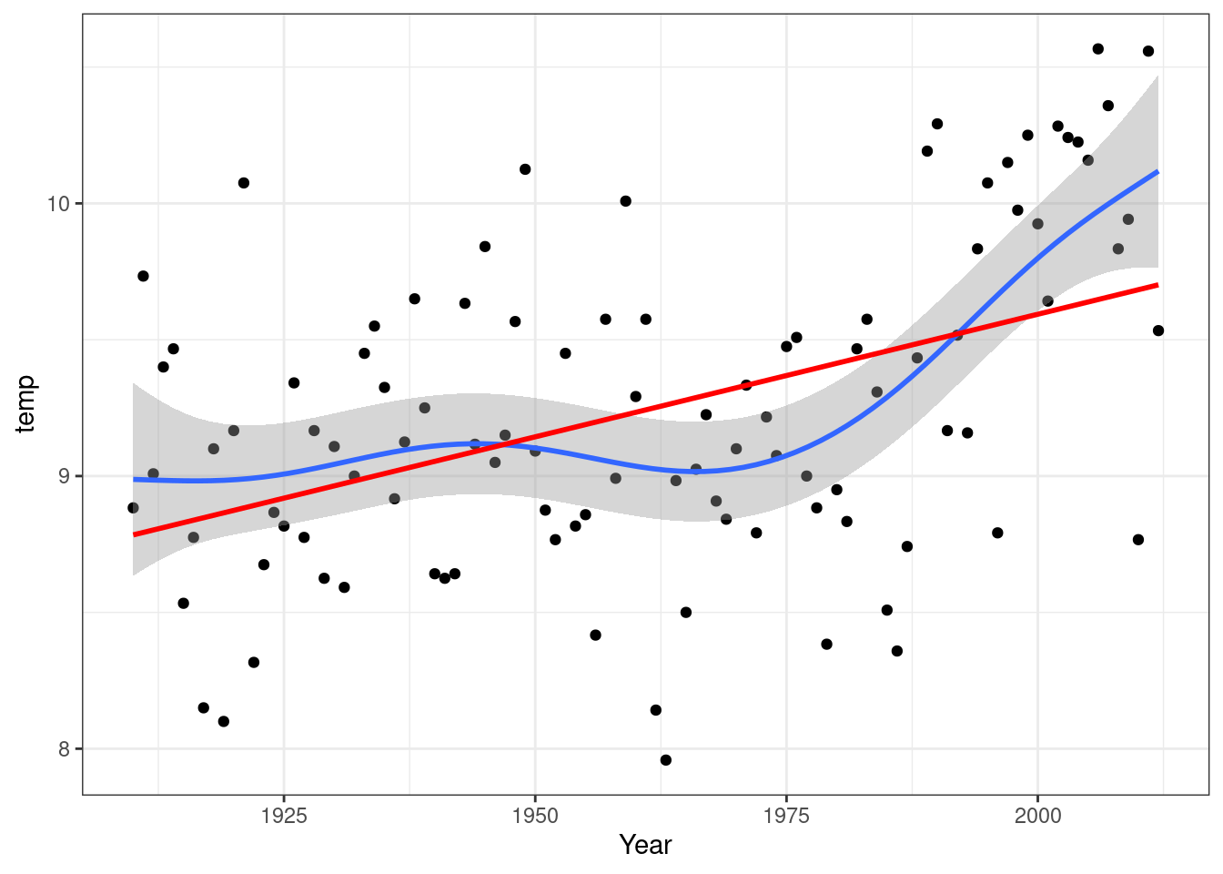
The smoother used here is taken from the mgcv package and is a generalised additive model (GAM). Note that the R code includes se=FALSE which removes the confidence interval for the linear model. This is used here to avoid clutter when the two models are superimposed, but if only the linear model were used the confidence interval would be added as usual. However it would not be strictly valid due to the important violation of the assumption.
Smoothed models do not use an equation that can be written down. Therefore there is no slope to report. They do produce an R squared value. It is also possible to extract the residuals from the model in order to look at the differences between observations and the fitted smmoth trend.
mod<-gam(data=TMean,temp~s(Year))
summary(mod)
##
## Family: gaussian
## Link function: identity
##
## Formula:
## temp ~ s(Year)
##
## Parametric coefficients:
## Estimate Std. Error t value Pr(>|t|)
## (Intercept) 9.243 0.047 196.7 <2e-16 ***
## ---
## Signif. codes: 0 '***' 0.001 '**' 0.01 '*' 0.05 '.' 0.1 ' ' 1
##
## Approximate significance of smooth terms:
## edf Ref.df F p-value
## s(Year) 5.885 7.044 8.14 <2e-16 ***
## ---
## Signif. codes: 0 '***' 0.001 '**' 0.01 '*' 0.05 '.' 0.1 ' ' 1
##
## R-sq.(adj) = 0.348 Deviance explained = 38.6%
## GCV = 0.24382 Scale est. = 0.22753 n = 10311.14.1 Advice on writing up
In this case you need to discuss the pattern of the response as shown in the scatter-plot with fitted spline. The significance of the overall model can be quoted, but the emphasis falls on the shape of the response and “local” features such a break points and changes in slope.
You might note that there was a very clear linear trend between 1975 and 2010. There was a short period of slight cooling between 1940 and 1975. In a data set with very interpretable single values such as this one you may want to mention extremely cool and warm years explicitly.
It is possible to cautiously report the linear trend derived from a regression, but with the caveat that the model does not provide a good fit to the data throughout the range. More advanced techniques can be applied to look more carefully at the response, but once again these are elements that are included in the AQM unit.
Simply visualising the shape of the response and describing it is useful and relevant for all data analysis. The spline approach does provide and R squared and a p-value that can be included in the text of a write up, together with comments and interpretation of the fit.