Chapter 7 More ggplots
7.1 Histograms
Typical histograms use only one variable at a time, although they may be “conditioned” by some grouping variable. The aim of a histogram is to show the distribution of the variable clearly. Let’s try ggplot histograms in ggplot2 using some simple data on mussel shell length at six sites.
library(aqm)
library(tidyverse)
data(mussels)
d<-mussels
To produce a simple histogram we only need to provide ggplot2 with the name of the variable we are going to use as the x aesthetic.
g0 <- ggplot(data=d,aes(x=Lshell))7.1.1 Default histogram
The default geom for the histogram is very simple. The goemetry is associated with statistical function that forms a histogram by counting the number of observation falling into the bins.
g0 + geom_histogram()
There are several things to notice here. One is that the default histogram looks rather like some of the figures in Excel. For some purposes this can be useful. However you may prefer to change this. This is easy to change. You are also warned that the default binwidth may not be ideal.
My own default settings for a histogram would therefore look more like this.
g1<-g0 +geom_histogram(fill="grey",colour="black",binwidth=10) + theme_bw()
g1
This should be self explanatory. The colour refers to the lines. It is usually a good idea to set the binwidth manually. You can choose the binwidth through trying a range before decising on which looks the best for your readers. Notice that I have assigned the results to an object called g1. We can then work with this to produce conditional histograms.
7.1.2 Facet wrapping
Conditioning the data on one grouping variable is very simple using a facet_wrap. Facets are the term used in ggplots for the panels in a lattice plot. There are two facet functions. Facet_wrap simply wraps a one dimensional set of panels into what should be a convenient number of columns and rows. You can set the number of columns and rows if the results are not as you want.
g_sites<-g1+facet_wrap(~Site)
g_sites
7.2 Boxplots
A grouped boxplot uses the grouping variable on the x axis. So we need to change the aesthetic mapping to reflect this.
g0 <- ggplot(d,aes(x=Site,y=Lshell))
g_box<-g0 + geom_boxplot(fill="grey",colour="black")+theme_bw()
g_box
7.3 Dynamic plots using plotly
A key feature of R that can only be used in HTML documents are dynamic plots. If you include any dynamic plot in a markdown document it cannot be knited into a word document. However these plots can be very useful for data exploration and in order to allow other users to interogate the data. The boxplots you produced can be turned into dynamic plots using the plotly package.
library(plotly) # This would normally be placed in the first chunk.
ggplotly(g_box)
Now if you hover the mouse over the plots you will see the key stats used in the boxplots.
7.4 Confidence interval plots
One important rule that you should try to follow when presenting data and carrying out any statistical test is to show confidence intervals for key parameters. Remember that boxplots show the actual data. Parameters extracted from the data are means when the data are grouped by a factor. When two or more numerical variables are combined the parameters refer to the statistical model, as in the case of regression.
Grammar of graphics provides a convenient way of adding statistical summaries to the figures. We can show the position of the mean mussel shell length for each site simply by asking to plot the mean for each y like this.
g0 <- ggplot(d,aes(x=Site,y=Lshell))
g_mean<-g0+stat_summary(fun=mean,geom="point")
g_mean
This is not very useful. However you can add confidence intervals themselves by a call to a stat_summary. The syntax is slightly involved.
g_mean+stat_summary(fun.data=mean_cl_normal,geom="errorbar")
To save some typing I’ve added a ci function to the aqm package that will add both these geometries to a graphic in one call.
g1<-aqm::ci(g0)
g1
If you want more robust confidence intervals with no assumption of normality of the residuals then you can use bootstrapping. In this case the result should be just about identical, as the errors are approximately normally distributed.
g_mean+stat_summary(fun.data=mean_cl_boot,geom="errorbar")
7.4.1 Dynamite plots (Don’t use!)
The traditional “dynamite” plots with a confidence interval over a bar can be formed in the same way.
g0 <- ggplot(d,aes(x=Site,y=Lshell))
g_mean<-g0+stat_summary(fun=base::mean,geom="bar")
g_mean+stat_summary(fun.data=mean_cl_normal,geom="errorbar")
Most statisticians prefer that the means are shown as points rather than bars. You may want to look at the discussion on this provided by Ben Bolker.
7.4.2 Inference on medians
One way to infer differences between medians is to plot boxplots with notches.
g0 <- ggplot(d,aes(x=Site,y=Lshell))
g_box<-g0 + geom_boxplot(fill="grey",colour="black", notch=TRUE)+theme_bw()
g_box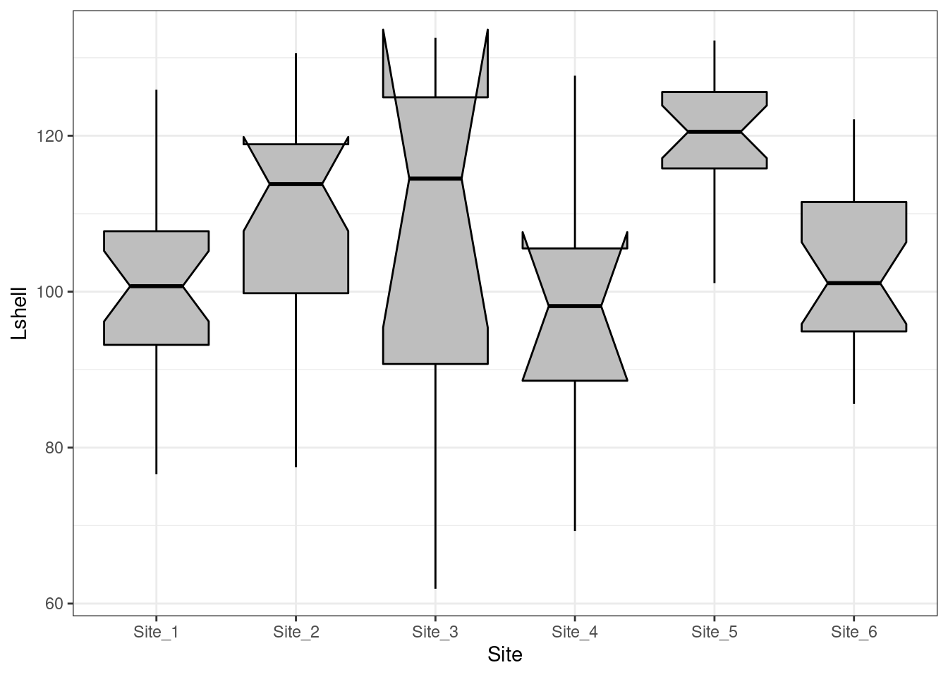
The notch forms a confidence interval around the median. This is based on the median \(\frac {\pm 1.57 IQR} {\sqrt(n)}\). According to Graphical Methods for Data Analysis (Chambers, 1983) although not a formal test the, if two boxes’ notches do not overlap there is ‘strong evidence’ (95% confidence) thet their medians differ.
A more precise appraoch is to use bootstrapping to calculate confidence intervals.
# Function included in aqm package

# median_cl_boot <- function(x, conf = 0.95) {
#   lconf <- (1 - conf)/2
#   uconf <- 1 - lconf
#   require(boot)
#   bmedian <- function(x, ind) median(x[ind])
#   bt <- boot(x, bmedian, 1000)
#   bb <- boot.ci(bt, type = "perc")
#   data.frame(y = median(x), ymin = quantile(bt$t, lconf), ymax = quantile(bt$t,
#                                                                           uconf))
# }
This has been added to the aqm package. So using this function the medians and confidence intervals can be plotted. This is a valid apprach even for skewed data.
g0+ stat_summary(fun.data = aqm::median_cl_boot, geom = "errorbar") + stat_summary(fun = median, geom = "point")
You can now draw inference on the differences in the usual way.
7.5 Scatterplots
Scatterplots can be built up in a similar manner. We first need to define the aesthetics. In this case there are clearly a and y coordinates that need to be mapped to the names of the variables.
g0 <- ggplot(d,aes(x=Lshell,y=BTVolume))

g0+geom_point()
7.5.1 Adding a regression line
It is very easy to add a regression line with confidence intervals to the plot.
g0+geom_point()+geom_smooth(method = "lm", se = TRUE)
Although the syntax reads “se=TRUE” this refers to 95% confidence intervals.
7.5.2 Grouping and conditioning
There are various ways of plotting regressions for each site. We could define a colour aesthetic that will automatically group the data and then plot all the lines as one figure.
g0 <- ggplot(d,aes(x=Lshell,y=BTVolume,colour=Site))
g1<-g0+geom_point()+geom_smooth(method = "lm", se = TRUE)
g2<-g1+geom_point(aes(col=factor(Site)))
g2
This can be split into panels using facet wrapping.
g2+facet_wrap(~Site)
7.5.3 Curvilinear relationships
Many models involving two variables can be visualised using ggplot.
d<-read.csv(system.file("extdata", "marineinverts.csv", package = "aqm"))
str(d)
## 'data.frame': 45 obs. of 4 variables:
## $ richness: int 0 2 8 13 17 10 10 9 19 8 ...
## $ grain : num 450 370 192 194 197 ...
## $ height : num 2.255 0.865 1.19 -1.336 -1.334 ...
## $ salinity: num 27.1 27.1 29.6 29.4 29.6 29.4 29.4 29.6 29.6 29.6 ...g0<-ggplot(d,aes(x=grain,y=richness))
g1<-g0+geom_point()+geom_smooth(method="lm", se=TRUE)
g1
g2<-g0+geom_point()+geom_smooth(method="lm",formula=y~x+I(x^2), se=TRUE)
g2
g3<-g0+geom_point()+geom_smooth(method="loess", se=TRUE)
g3
You can also use a gam directly.
g4<-g0+geom_point()+stat_smooth(method = "gam", formula = y ~ s(x))
g4
The plots can be arranged on a single page using the multiplot function taken from a cookbook for R.
multiplot(g1,g2,g3,g4,cols=2)
7.6 Generalised linear models
Ggplots conveniently show the results of prediction from a generalised linear model on the response scale. This is an advanced topic covered in AQM. The code for the plots is included here for future reference. You can skip this section for the moment.
glm1<-g0+geom_point()+geom_smooth(method="glm", method.args=list(family="poisson"), se=TRUE) +ggtitle("Poisson")
glm1
glm2<-g0+geom_point()+geom_smooth(method="glm", method.args=list(family="quasipoisson"), se=TRUE) + ggtitle("Quasipoisson")
glm2
library(MASS)
glm3<-g0+geom_point()+geom_smooth(method="glm.nb", se=TRUE) +ggtitle("Negative binomial")
glm3
multiplot(glm1,glm2,glm3,cols=2)
7.7 Binomial data
The same approach can be taken to binomial data.
ragworm<-read.csv(system.file("extdata", "ragworm_test3.csv", package = "aqm"))
str(ragworm)
## 'data.frame': 100 obs. of 2 variables:
## $ presence: int 1 1 0 0 1 1 1 0 1 1 ...
## $ salinity: num 2.55 2.21 3.39 2.96 1.88 ...g0 <- ggplot(ragworm,aes(x=salinity,y=presence))
g1<-g0+geom_point()+stat_smooth(method="glm",formula = y~ x, method.args=list(family="binomial"))+ggtitle("Linear")
g2<-g0+geom_point()+stat_smooth(method="glm",formula = y~ x+I(x^2), method.args=list(family="binomial"))+ggtitle("Polynomial")
g3<-g0+geom_point()+stat_smooth(method = "gam", formula = y ~ s(x), method.args=list(family="binomial"))+ggtitle("GAM")
multiplot(g1,g2,g3,cols=2)
7.8 Learning more about ggplots
GGplots can be used to display very much more complex data sets than those shown in this handout.
A very useful resource if you want to try more advanced graphics is provided by the R cookbook pages.
http://www.cookbook-r.com/Graphs/
A detailed tutorial of gggplots is provided in chapter 3 of R for data science
https://r4ds.had.co.nz/data-visualisation.html
Some additional ideas are available here
http://r-statistics.co/Top50-Ggplot2-Visualizations-MasterList-R-Code.html
A flip book approach is taken here.
https://evamaerey.github.io/ggplot_flipbook/ggplot_flipbook_xaringan.html#23