Chapter 11 Fitting curves to data
In the previous class we have assumed that the underlying relationship between variables takes the form of a straight line. However in ecology the relationship between variables can have more complex forms. Sometimes the form can be predicted from theory. However we are often simply interested in finding a model that describes the data well and provides insight into processes.
11.1 Data exploration
The data we will first look at is analysed by Zuur et al (2007) but here it has been modified slightly in order to illustrate the point more clearly.
The data frame we will look at contains only two variables selected from a large number of measurements taken on sediment cores from Dutch beaches. The response variable is the richness of benthic invertebrates. The explanatory variable we are going to look at here is sediment grain size in mm. The data also contains measurements on height from mean sea level and salinity.
11.1.1 Visualisation
library(ggplot2)d<-read.csv("/home/aqm/course/data/marineinverts.csv")
DT::datatable(d)The first step in any analysis should be to look at the data.
Base graphics are good enough for a quick figure at this stage.
attach(d)
plot(richness~grain)
Or in ggplot
theme_set(theme_bw())
g0<-ggplot(data=d,aes(x=grain,y=richness))
g1<-g0+geom_point()
g1
There seems to be a pattern of an intial steep decline in richness as grain size increases, followed by a plateau. Let’s try fitting a linear regression to the data and plotting the results with confidence intervals.
Note This is not necessarily the correct analysis for these data. In fact there are many reasons why it is clearly an incorrect way of modelling the relationship. We will explore this as the class progresses, and in a later class we will revisit the data set in order to use a much better model. The exercise at this point is for illustrative, didactic purposes. You should think about the reasons for not using a simple model at every step, in order to understand why more advanced methods are needed.
Plotting confidence intervals using base graphics requires a few steps in base graphics, but you can see explicitly that these are constructed using the model predictions.
mod<-lm(richness~grain)
plot(richness~grain)
x<-seq(min(grain),max(grain),length=100)
matlines(x,predict(mod,newdata=list(grain=x),interval="confidence"))
It is, of course, usually much quicker and easier to use ggplots.
g2<-g1+geom_smooth(method="lm")
g2
## `geom_smooth()` using formula 'y ~ x'
The relationship is modelled quite well by a straight line, but it does not look completely convincing. There are two many points above the line on the left hand side of the figure and too many below on the right. If look at the first diagnostic plot for the model this is also apparent. The residuals are correlated as a result of the model not being of the correct form.
Look at the diagnostic plots.
anova(mod)## Analysis of Variance Table
##
## Response: richness
## Df Sum Sq Mean Sq F value Pr(>F)
## grain 1 385.13 385.13 23.113 1.896e-05 ***
## Residuals 43 716.52 16.66
## ---
## Signif. codes: 0 '***' 0.001 '**' 0.01 '*' 0.05 '.' 0.1 ' ' 1summary(mod)##
## Call:
## lm(formula = richness ~ grain)
##
## Residuals:
## Min 1Q Median 3Q Max
## -6.8386 -2.0383 -0.3526 2.5768 11.6620
##
## Coefficients:
## Estimate Std. Error t value Pr(>|t|)
## (Intercept) 18.669264 2.767726 6.745 3.01e-08 ***
## grain -0.046285 0.009628 -4.808 1.90e-05 ***
## ---
## Signif. codes: 0 '***' 0.001 '**' 0.01 '*' 0.05 '.' 0.1 ' ' 1
##
## Residual standard error: 4.082 on 43 degrees of freedom
## Multiple R-squared: 0.3496, Adjusted R-squared: 0.3345
## F-statistic: 23.11 on 1 and 43 DF, p-value: 1.896e-05par(mfcol=c(2,2))
plot(mod)
11.1.2 T values and significance in summary output
An element of the R output that you should be aware of at this point is the summary table. If you look at this table you will see that for each parameter there is an estimate of its value together with a standard error. The confidence interval for the parameter is approximately plus or minus twice the standard error. The T value is a measure of how far from zero the estimated parameter value lies in units of standard error. So generally speaking t values of 2 or more will be statistically significant. This may be useful, but it certainly does not suggest that parameter is useful in itself. To evaluate whether a parameter should be included requires taking a “whole model” approach.
Remember that a p-value only tells you how likely you would be to get the value of t (or any other statistic with a known distribution such as an F value) if the null model were true. It doesn’t really tell you that much directly about the model you actually have.
11.1.3 Testing for curvilearity
We can check whether a strait line is a good representation of the pattern using the reset test that will have a low p-value if the linear form of the model is not a good fit.
library(lmtest)## Loading required package: zoo##
## Attaching package: 'zoo'## The following objects are masked from 'package:base':
##
## as.Date, as.Date.numericresettest(richness ~ grain)##
## RESET test
##
## data: richness ~ grain
## RESET = 19.074, df1 = 2, df2 = 41, p-value = 1.393e-06The Durbin Watson test which helps to confirm serial autocorrelation that may be the result of a misformed model will often also be significant when residuals cluster on one side of the line.
dwtest(richness~grain)##
## Durbin-Watson test
##
## data: richness ~ grain
## DW = 1.7809, p-value = 0.1902
## alternative hypothesis: true autocorrelation is greater than 0In this case it was not, but this may be because there were too few data points.
11.2 Polynomials
The traditional method for modelling curvilinear relationships when a functional form of the relationship is not assumed is to use polynomials. Adding quadratic, cubic or higher terms to a model gives it flexibility and allows the line to adopt different shapes. The simplest example is a quadratic relationship which takes the form of a parabola.
\(y=a+bx+cx^{2} +\epsilon\) where \(\epsilon=N(o,\sigma^{2})\)
x<-1:100
y<-10+2*x-0.02*x^2
plot(y~x,type="l")
If the quadratic term has a small value the curve may look more like a hyperbola over the data range.
x<-1:100
y<-10+2*x-0.01*x^2
plot(y~x,type="l")
We can add a quadratic term to the model formula in R very easily.
The syntax is lm(richness ~ grain+I(grain^2)).
The “I” is used to isolate the expression so that it is interpreted literally in mathematical terms. Notice that we are still using lm, i.e. a general linear model. This is because mathematically the terms still enter in a “linear” manner. So linear models can produce curves!
We canplot the predictions explicitly using base graphics.
mod2<-lm(richness~grain+I(grain^2))
plot(richness~grain)
x<-seq(min(grain),max(grain),length=100)
matlines(x,predict(mod2,newdata=list(grain=x),interval="confidence"))
Or using ggplot.
g1+geom_smooth(method="lm",formula=y~x+I(x^2), se=TRUE)
anova(mod2)## Analysis of Variance Table
##
## Response: richness
## Df Sum Sq Mean Sq F value Pr(>F)
## grain 1 385.13 385.13 29.811 2.365e-06 ***
## I(grain^2) 1 173.93 173.93 13.463 0.00068 ***
## Residuals 42 542.59 12.92
## ---
## Signif. codes: 0 '***' 0.001 '**' 0.01 '*' 0.05 '.' 0.1 ' ' 1summary(mod2)##
## Call:
## lm(formula = richness ~ grain + I(grain^2))
##
## Residuals:
## Min 1Q Median 3Q Max
## -6.5779 -2.5315 0.2172 2.1013 8.3415
##
## Coefficients:
## Estimate Std. Error t value Pr(>|t|)
## (Intercept) 53.0133538 9.6721492 5.481 2.21e-06 ***
## grain -0.2921821 0.0675505 -4.325 9.19e-05 ***
## I(grain^2) 0.0004189 0.0001142 3.669 0.00068 ***
## ---
## Signif. codes: 0 '***' 0.001 '**' 0.01 '*' 0.05 '.' 0.1 ' ' 1
##
## Residual standard error: 3.594 on 42 degrees of freedom
## Multiple R-squared: 0.5075, Adjusted R-squared: 0.484
## F-statistic: 21.64 on 2 and 42 DF, p-value: 3.476e-07We now have a higher value of R squared and a better fitting model.
But the shape does not look right. The quadratic is constrained in form and has started to rise at the high end of the x axis. This does not make a great deal of sense.
We can give the model more flexibility by adding another term.
mod3<-lm(richness~grain+I(grain^2)+I(grain^3))
plot(richness~grain)
x<-seq(min(grain),max(grain),length=100)
matlines(x,predict(mod3,newdata=list(grain=x),interval="confidence"))
g1+geom_smooth(method="lm",formula=y~x+I(x^2)++I(x^3), se=TRUE)
anova(mod3)## Analysis of Variance Table
##
## Response: richness
## Df Sum Sq Mean Sq F value Pr(>F)
## grain 1 385.13 385.13 42.542 7.820e-08 ***
## I(grain^2) 1 173.93 173.93 19.212 7.944e-05 ***
## I(grain^3) 1 171.42 171.42 18.936 8.768e-05 ***
## Residuals 41 371.17 9.05
## ---
## Signif. codes: 0 '***' 0.001 '**' 0.01 '*' 0.05 '.' 0.1 ' ' 1summary(mod3)##
## Call:
## lm(formula = richness ~ grain + I(grain^2) + I(grain^3))
##
## Residuals:
## Min 1Q Median 3Q Max
## -6.5250 -1.8841 -0.2896 2.2259 7.9431
##
## Coefficients:
## Estimate Std. Error t value Pr(>|t|)
## (Intercept) 1.955e+02 3.373e+01 5.796 8.44e-07 ***
## grain -1.784e+00 3.474e-01 -5.134 7.27e-06 ***
## I(grain^2) 5.420e-03 1.153e-03 4.700 2.93e-05 ***
## I(grain^3) -5.386e-06 1.238e-06 -4.352 8.77e-05 ***
## ---
## Signif. codes: 0 '***' 0.001 '**' 0.01 '*' 0.05 '.' 0.1 ' ' 1
##
## Residual standard error: 3.009 on 41 degrees of freedom
## Multiple R-squared: 0.6631, Adjusted R-squared: 0.6384
## F-statistic: 26.9 on 3 and 41 DF, p-value: 8.838e-10This produces a better fit statistically, but things are now getting very confusing. It is not clear what the third term is actually doing. The confidence intervals are quite wide, so we could ignore the sharp downturn, as any shape within the confidence intervals is permissible. But the model still does not look right.
The advantages of polynomials is that they do result in a formula that can be written down and provided as a predictive model. The major disadvantage is that the formula is rather complex and has no intrinisic biological or ecological basis. You must also be very careful never to use these models to predict values that fall outside the range used for fitting. Also the formulae produced by fitting polynomials are often used without regard to the confidence intervals. Uncertainty is part of the statistical model and should be taken into account.
11.3 Splines
A commonly used alternative to polynomials is to fit a so called smoother of some description. There are many different ways to go about this, making the subject seem complicated. However for most practical purposes they produce similar results and we can rely on the software to make most of the decisions.
The most commonly used smoothers are splines of some type. These work by fitting curves to sections of the data and then splicing the results together. This gives the curves much greater flexibility that polynomials. Almost any shape can be fitted.
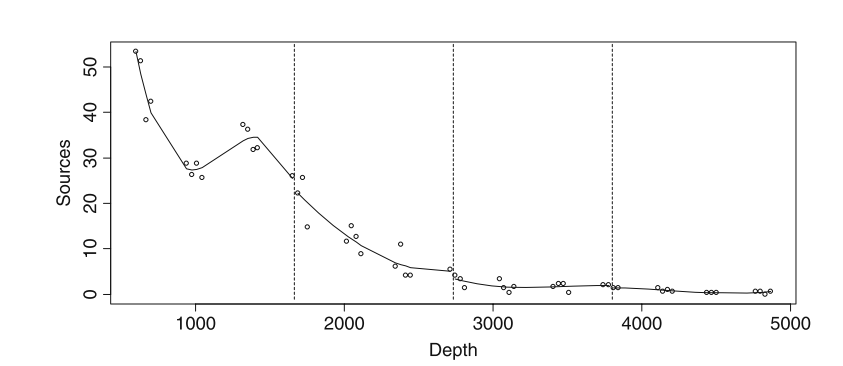
alt text
The issue with this involves complexity. If we let the curves become too flexible we could fit a line to that passed through all the data points. But this would not be useful and would leave no degrees of freedom. The degree of waviness is selected in R automatically by cross validation if we use the mgcv package. There is no guarantee that the model will be biologically meaningful, but many times the selection produces a curve that fits the data well and can be interpreted.
library(mgcv)## Loading required package: nlme## This is mgcv 1.8-24. For overview type 'help("mgcv-package")'.mod4<-gam(richness~s(grain))
summary(mod4)##
## Family: gaussian
## Link function: identity
##
## Formula:
## richness ~ s(grain)
##
## Parametric coefficients:
## Estimate Std. Error t value Pr(>|t|)
## (Intercept) 5.6889 0.4601 12.36 2.6e-15 ***
## ---
## Signif. codes: 0 '***' 0.001 '**' 0.01 '*' 0.05 '.' 0.1 ' ' 1
##
## Approximate significance of smooth terms:
## edf Ref.df F p-value
## s(grain) 3.615 4.468 15.92 3.25e-09 ***
## ---
## Signif. codes: 0 '***' 0.001 '**' 0.01 '*' 0.05 '.' 0.1 ' ' 1
##
## R-sq.(adj) = 0.619 Deviance explained = 65.1%
## GCV = 10.616 Scale est. = 9.5269 n = 45The summary gives a p-value for the term and also shows the estimated degrees of freedom. The more complex the response, the more degrees of freedom are used in fitting the model.
Unlike regression models there is no formula associated with the model. So it can be difficult to communicate the results. The usual way of presenting the model is graphically.
plot(mod4)
Notice that the plot shows differences from the mean value (intercept) associated with the smoothed term in the model. Splines can suffer from some of the same problems as polynomials, but they often lead to a curve that has more intrinsic meaning.
g1+stat_smooth(method = "gam", formula = y ~ s(x))
11.4 Complex shapes
The next data set is on the Gonadosomatic index (GSI, i.e., the weight of the gonads relative to total body weight) of squid Measurements were taken from squid caught at various locations and months in Scottish waters.
squid<-read.csv("/home/aqm/course/data/squid.csv")We can plot out the data using a conditional box and whisker plot.
squid$month<-as.factor(squid$MONTH)g0<-ggplot(data=squid,aes(x=month,y=GSI))
g1<-g0+geom_boxplot()
g1+facet_wrap("Sex")
It seems sensible to split the data by gender.
males<-subset(squid,Sex=="Male")
females<-subset(squid,Sex=="Female")
Now we can try representing the pattern of change over the year using a spline model fit using mgcv.
mod1<-gam(GSI~s(MONTH),data=females)
plot(mod1)
summary(mod1)##
## Family: gaussian
## Link function: identity
##
## Formula:
## GSI ~ s(MONTH)
##
## Parametric coefficients:
## Estimate Std. Error t value Pr(>|t|)
## (Intercept) 3.27244 0.06651 49.2 <2e-16 ***
## ---
## Signif. codes: 0 '***' 0.001 '**' 0.01 '*' 0.05 '.' 0.1 ' ' 1
##
## Approximate significance of smooth terms:
## edf Ref.df F p-value
## s(MONTH) 8.93 8.999 156.7 <2e-16 ***
## ---
## Signif. codes: 0 '***' 0.001 '**' 0.01 '*' 0.05 '.' 0.1 ' ' 1
##
## R-sq.(adj) = 0.53 Deviance explained = 53.4%
## GCV = 5.5387 Scale est. = 5.4944 n = 1242g0<-ggplot(data=females, aes(x=MONTH,y=GSI))
g1<-g0+geom_point()
g1+stat_smooth(method = "gam", formula = y ~ s(x))
The statistics are OK, but the biology seems wrong. The dip in the curve in October does not seem to make sense. Although the number of knots in the spline are determined by cross validation we can lower them in order to produce a simpler model.
mod2<-gam(GSI~s(MONTH,k=8),data=females)
plot(mod2)
summary(mod2)##
## Family: gaussian
## Link function: identity
##
## Formula:
## GSI ~ s(MONTH, k = 8)
##
## Parametric coefficients:
## Estimate Std. Error t value Pr(>|t|)
## (Intercept) 3.27244 0.06848 47.79 <2e-16 ***
## ---
## Signif. codes: 0 '***' 0.001 '**' 0.01 '*' 0.05 '.' 0.1 ' ' 1
##
## Approximate significance of smooth terms:
## edf Ref.df F p-value
## s(MONTH) 6.815 6.987 179.8 <2e-16 ***
## ---
## Signif. codes: 0 '***' 0.001 '**' 0.01 '*' 0.05 '.' 0.1 ' ' 1
##
## R-sq.(adj) = 0.502 Deviance explained = 50.5%
## GCV = 5.8608 Scale est. = 5.8239 n = 1242g1+stat_smooth(method = "gam", formula = y ~ s(x,k=8))
mod3<-gam(GSI~s(MONTH,k=7),data=females)
plot(mod3)
summary(mod3)##
## Family: gaussian
## Link function: identity
##
## Formula:
## GSI ~ s(MONTH, k = 7)
##
## Parametric coefficients:
## Estimate Std. Error t value Pr(>|t|)
## (Intercept) 3.27244 0.06896 47.46 <2e-16 ***
## ---
## Signif. codes: 0 '***' 0.001 '**' 0.01 '*' 0.05 '.' 0.1 ' ' 1
##
## Approximate significance of smooth terms:
## edf Ref.df F p-value
## s(MONTH) 5.047 5.655 213.7 <2e-16 ***
## ---
## Signif. codes: 0 '***' 0.001 '**' 0.01 '*' 0.05 '.' 0.1 ' ' 1
##
## R-sq.(adj) = 0.495 Deviance explained = 49.7%
## GCV = 5.9348 Scale est. = 5.9059 n = 1242g1+stat_smooth(method = "gam", formula = y ~ s(x,k=7))
By reducing the number of knots we have models which use fewer degrees of freedom. However the fit as measured by the deviance explained (R squared in this case) is reduced.
We can test whether the first model is significantly better. We find that it is.
anova(mod1,mod2,mod3,test="F")## Analysis of Deviance Table
##
## Model 1: GSI ~ s(MONTH)
## Model 2: GSI ~ s(MONTH, k = 8)
## Model 3: GSI ~ s(MONTH, k = 7)
## Resid. Df Resid. Dev Df Deviance F Pr(>F)
## 1 1232.0 6769.5
## 2 1234.0 7187.8 -2.0115 -418.25 37.844 < 2.2e-16 ***
## 3 1235.3 7299.4 -1.3317 -111.67 15.263 1.391e-05 ***
## ---
## Signif. codes: 0 '***' 0.001 '**' 0.01 '*' 0.05 '.' 0.1 ' ' 1So we are left with a difficulty. The statistical criteria lead to a wavy model, while common sense suggest that there is some issue that has not been taken into account. In such a situation we should look for additional variables that have not been measured. Perhaps some of the squid that were caught actually came from a separate population with a different timing of reproduction.
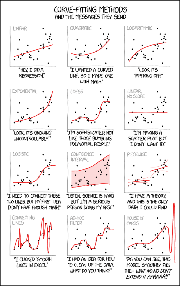
11.5 Summary
Some of the issues we’ve looked at can be summed up in this light hearted cartoon depiction. Fitting curves to data is challenging, so be prepared to justify your approach.